
Prototyping a B2B Ordering Platform with Claude Design
An interactive, mobile-first rebuild of the ordering platform I helped create, prototyped with Claude.
Years ago my team at Crucial Networking moved a frozen food distributor’s orders from paper forms to a self-service website. Online sales grew from $0 to $2.5MM in under two years. This project asks what that order form should look like in 2026.
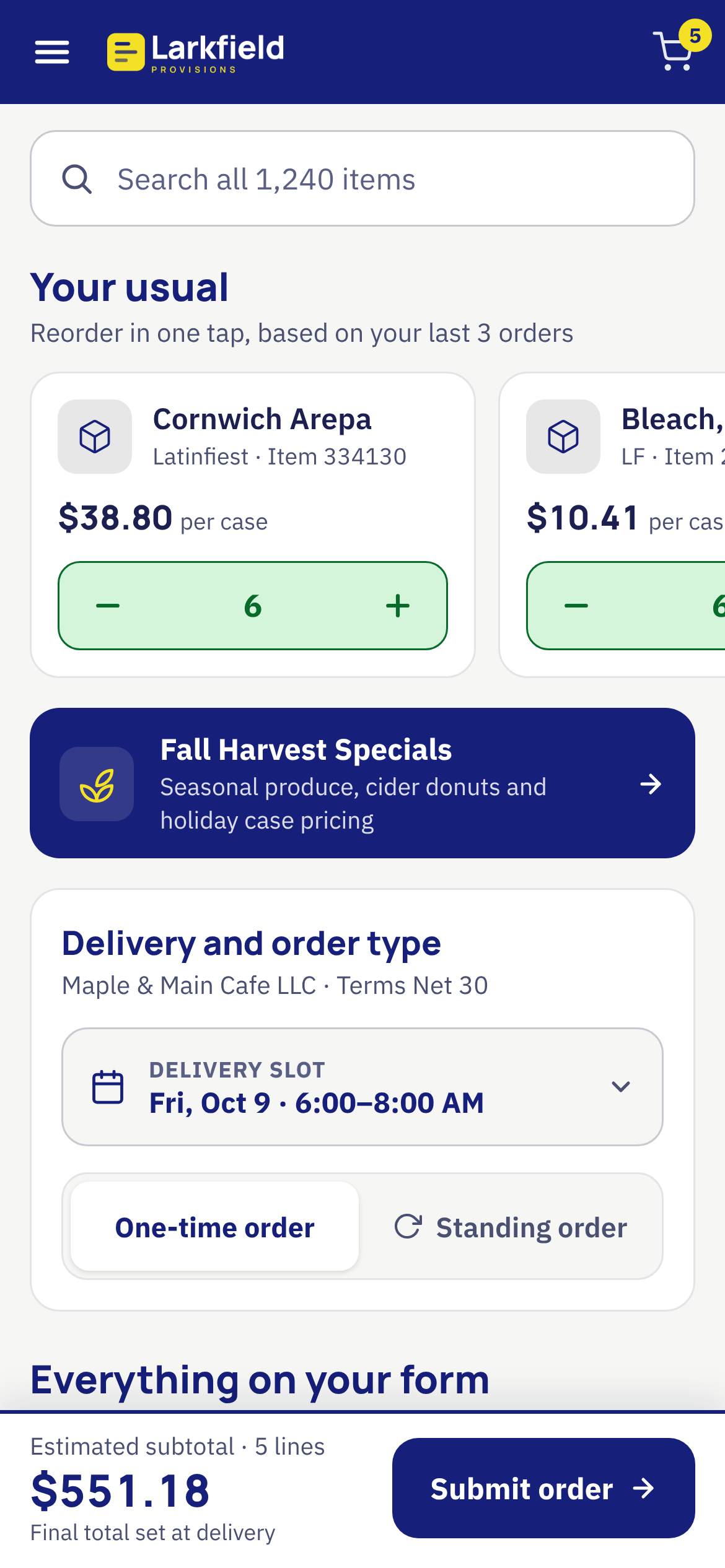
I redesigned it as an interactive prototype that works on a desktop and on a phone. I kept the original lesson at the center: customers order more when they can see everything available.
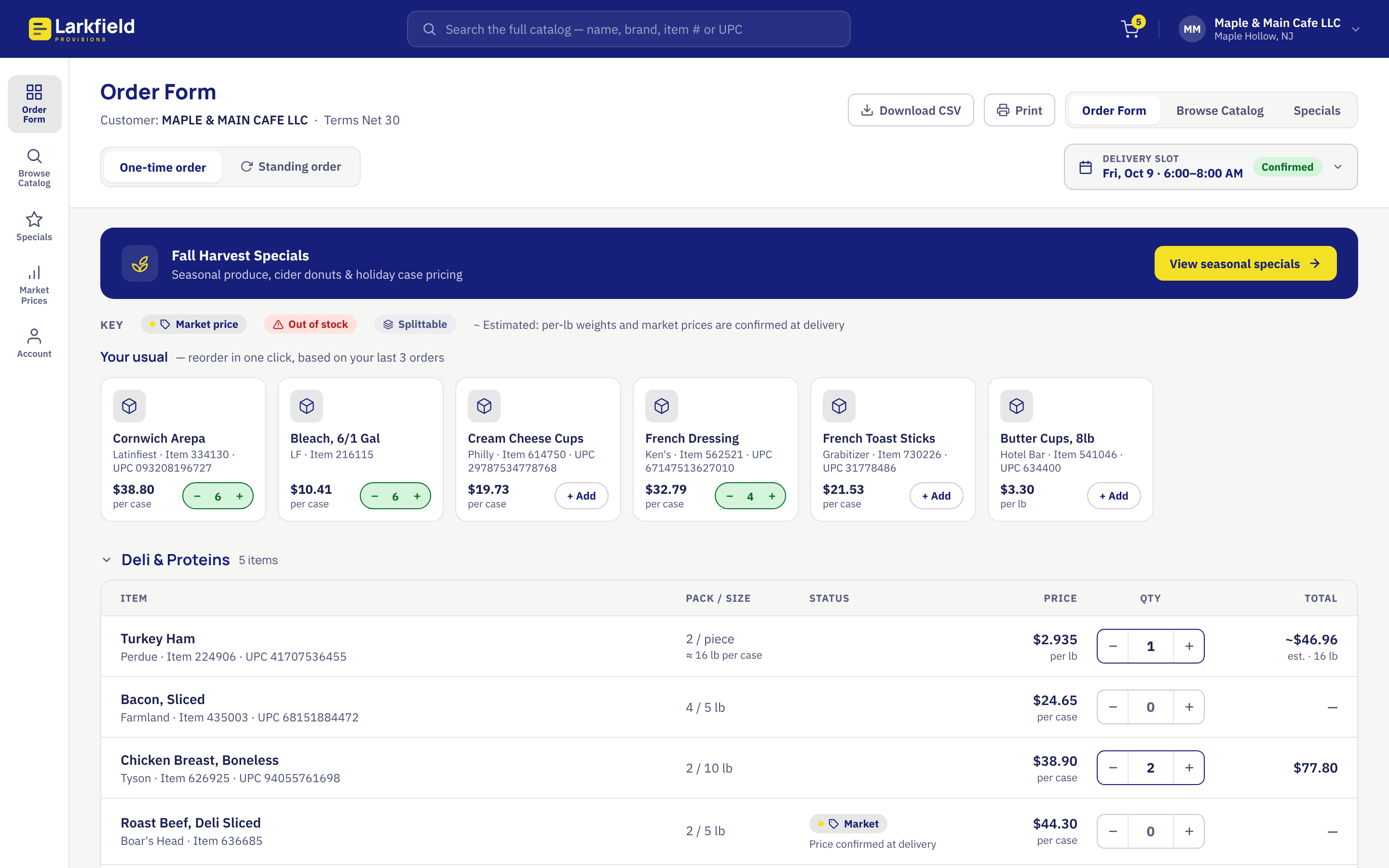
Frozen foods order system interactive prototype using Claude – desktop and mobile views
Where this started
Before the original platform, the distributor’s salespeople drove to each customer with a clipboard. They filled out a paper order form by hand. The form went back to the office, where someone keyed it in. Then someone delivered the order to the warehouse by hand. Every order passed through three manual handoffs.
The customers ranged from large operations to the average greasy spoon on the East Coast. Most of them were not tech-savvy.
I worked on the self-service platform that replaced that process. I handled UX research, design and front-end development. My co-founder built the backend. Our third partner handled IT and account management. The salespeople were wary at first. They worried the site would cut them out of their customer relationships. They came around once order volume and their own numbers went up.
The bigger finding was about behavior. Before the site, customers kept ordering what they already knew. Once they could see the whole catalog, they ordered more.
The problem in 2026
The original platform worked at a desk. Today I treat the phone as the starting point for any web work. A buyer should be able to reorder from a phone without pinching and zooming a table.
A faster reorder carries its own risk. A form built around “your usual” makes ordering quick. It also rebuilds the trap the original platform escaped, where customers only buy what they already know. The redesign had to speed up reorders without shrinking the customer’s view back to their usual items.
Pricing needed a more honest treatment. A distributor sells some items by the case and others by the pound or by the dozen. A per-pound item has no exact price until it is weighed. A form that multiplies price by quantity hides that.
Approach
Three rules
- Start from the phone.
- Keep discovery on the main screen.
- Use plain labels and big targets, because many buyers are not tech-savvy.
Every design call below traces back to one of those.
“Your Usual” Comes First
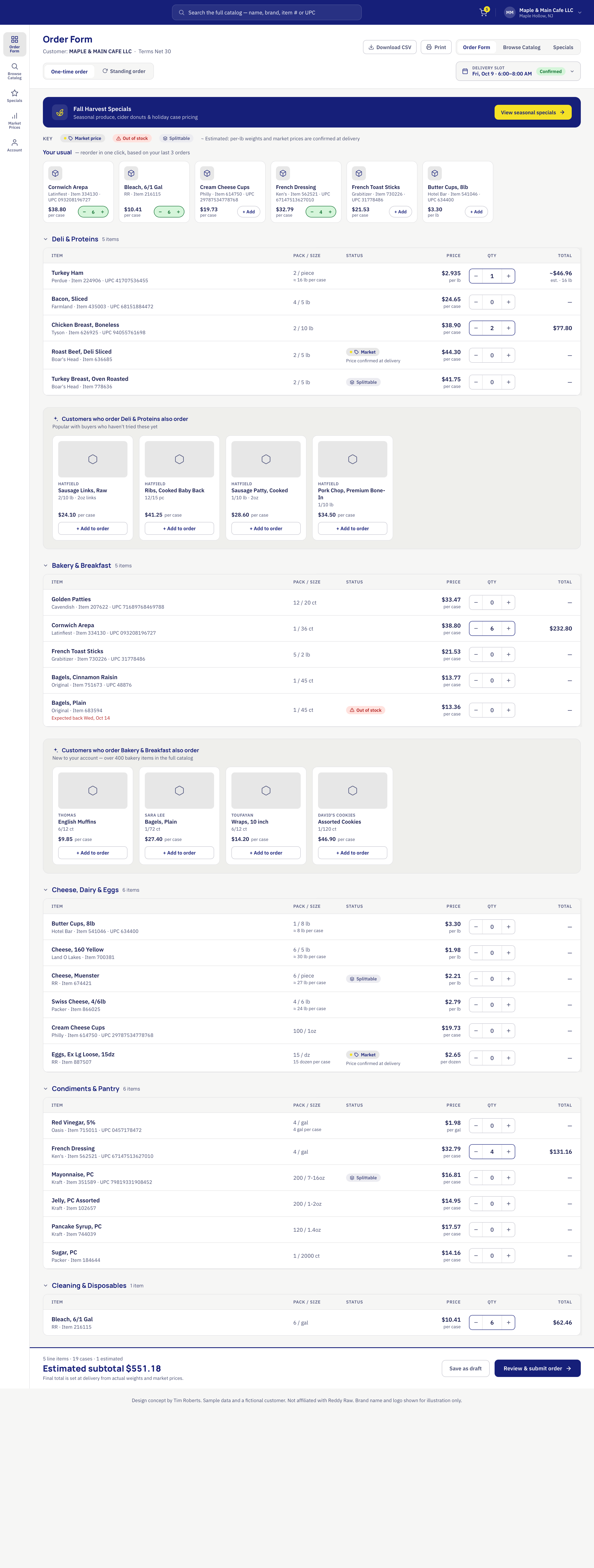
The top of the form shows the items a customer orders most, as cards with a one-tap add. On the phone the quantity stepper is 48 pixels tall. Every other button is at least 44 pixels.
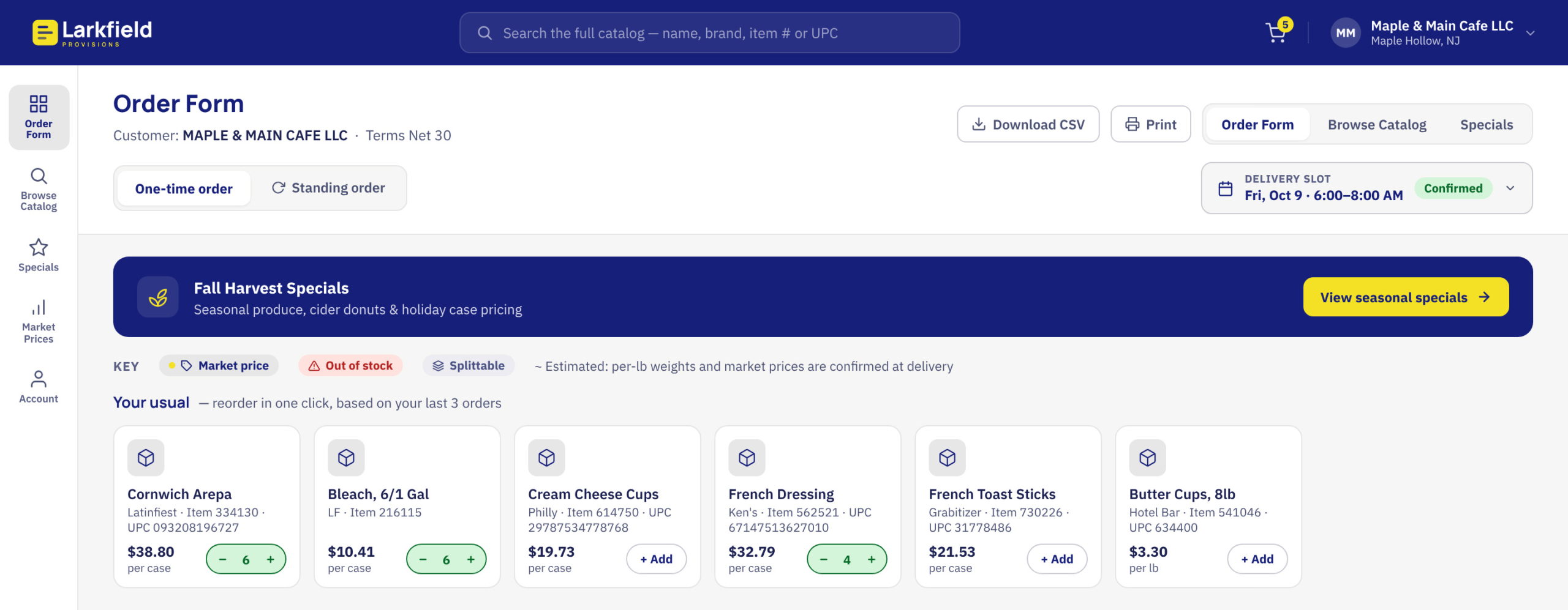
Your usual comes first, with a one-tap add and thumb-sized steppers.
Discovery lives inside every category
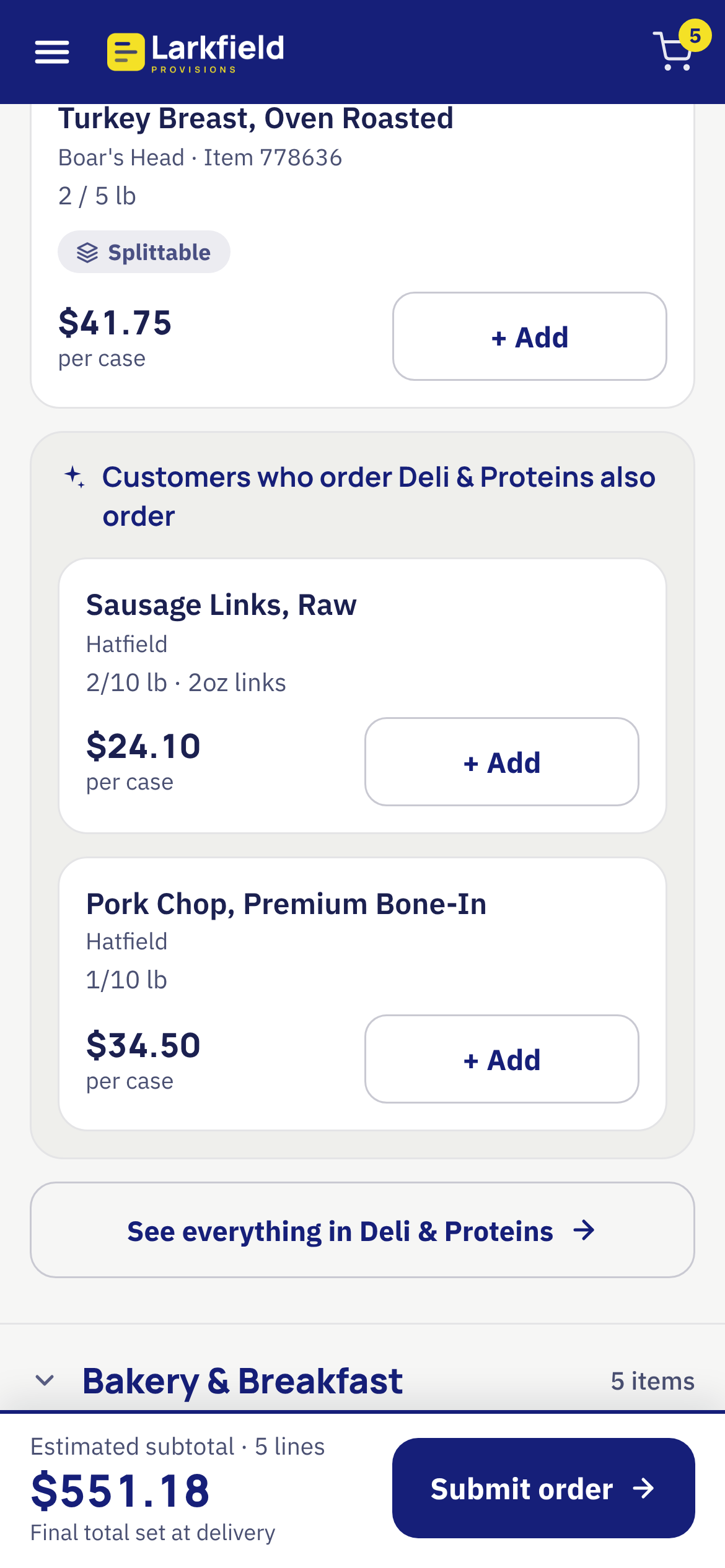
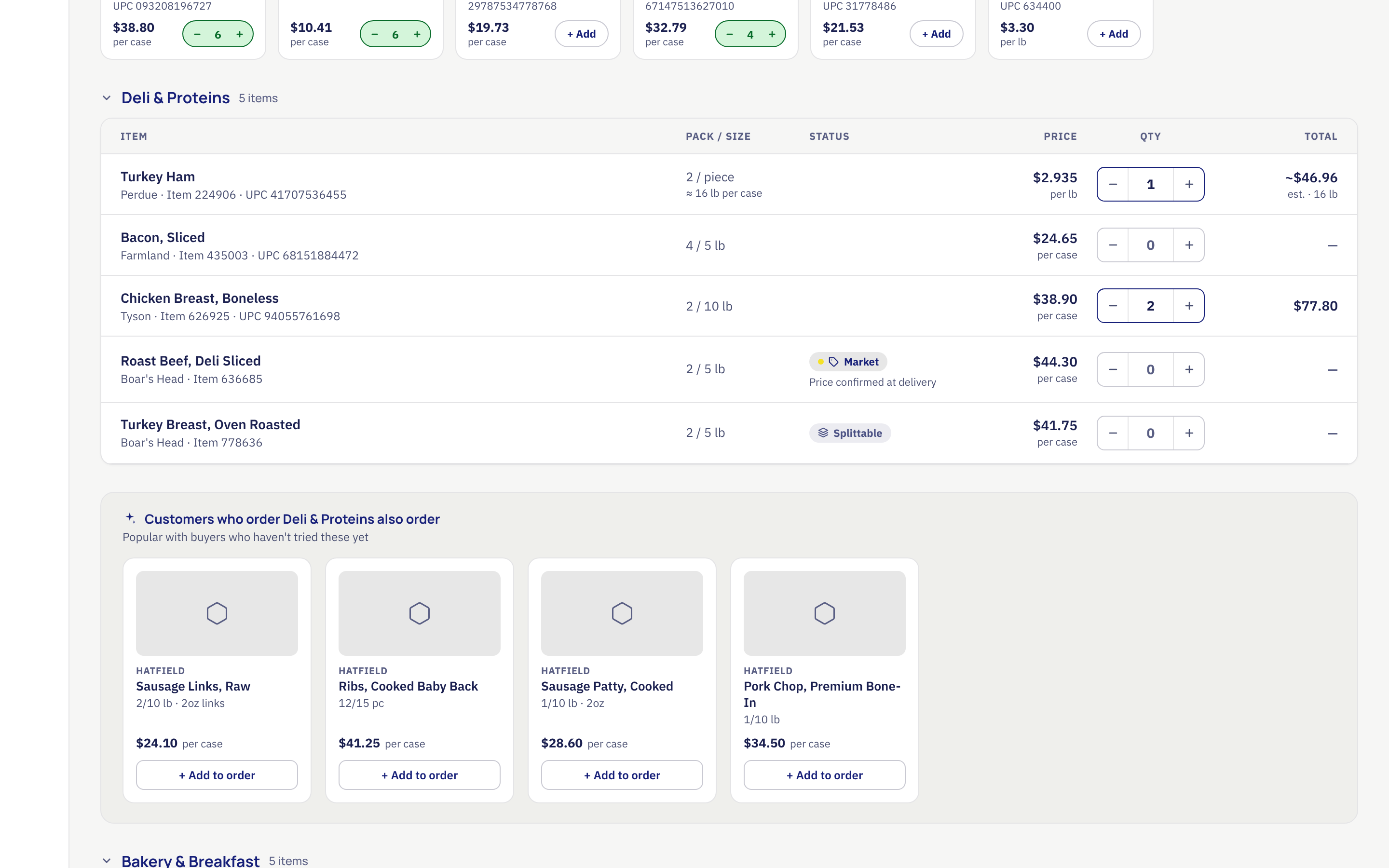
On desktop, each category carries a row of “customers who order this also order” suggestions. On the phone, each category shows the customer’s own items first, then two suggestions, then a “See everything in” button.
Search covers the full catalog from the top of the screen. If something had to go for simplicity, I’d cut utilities like CSV export and print before I touched discovery.
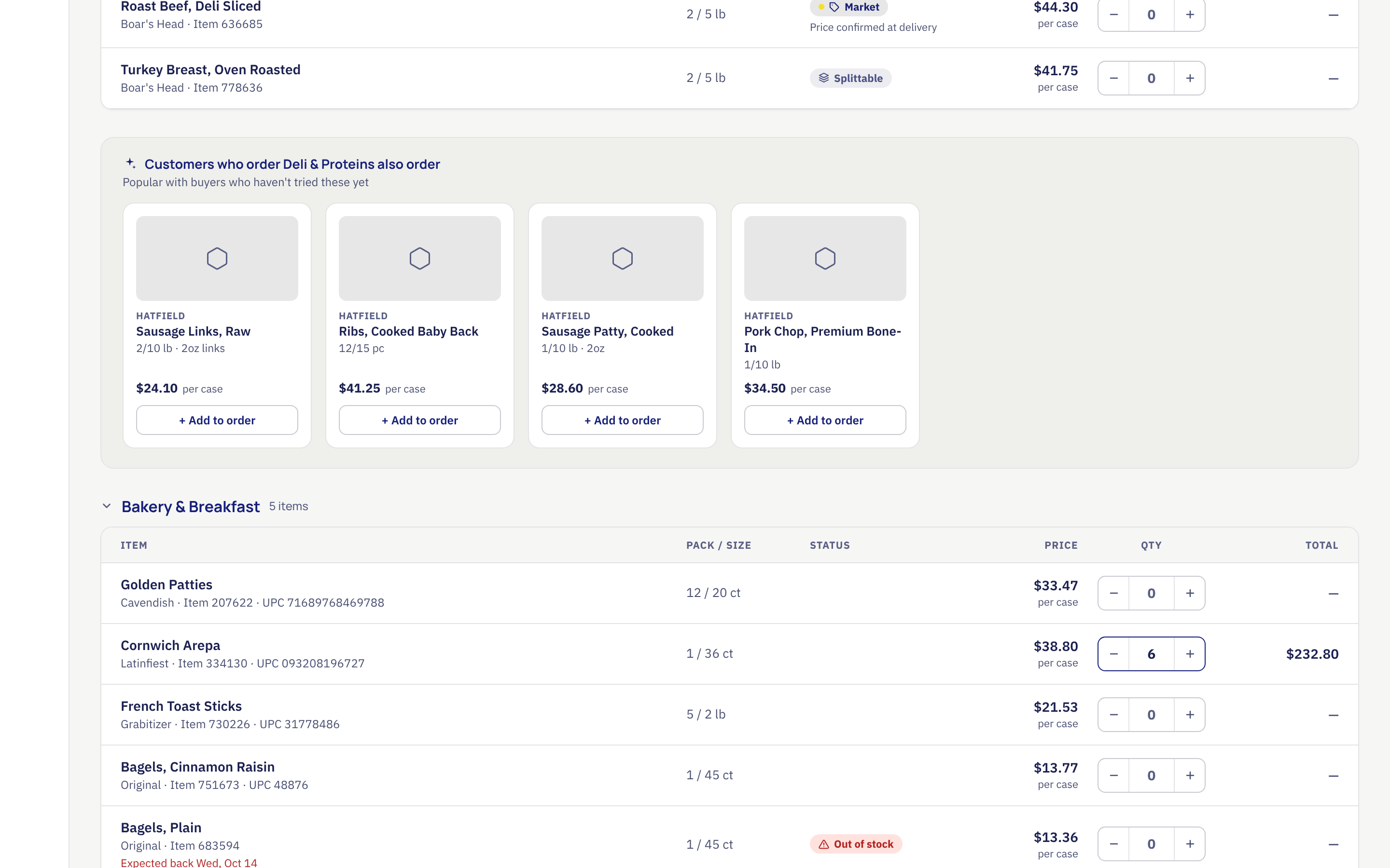
Suggestions sit inside each category, after the customer’s own items
Prices say what they are
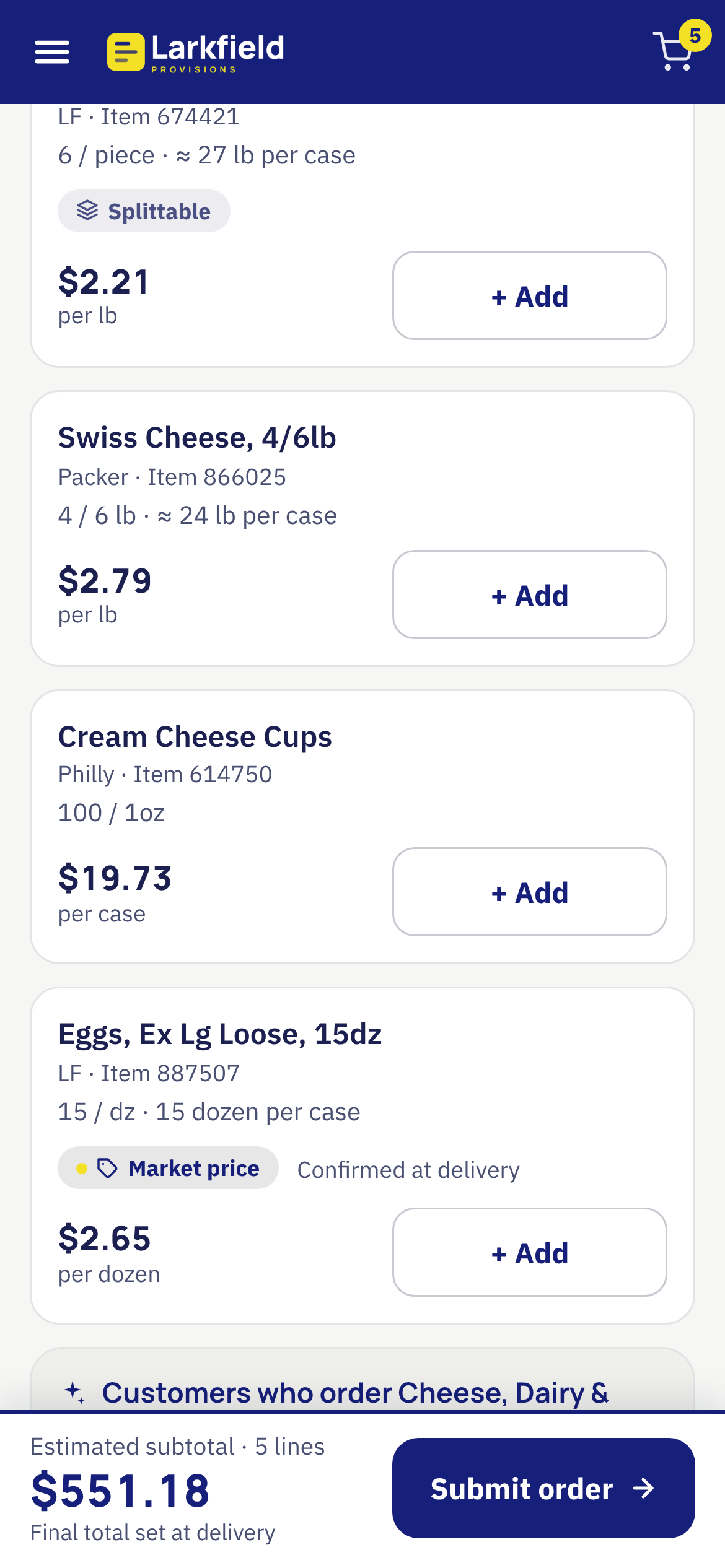
Every row shows its unit: per case, per pound, per dozen or per gallon.
For per-pound items the form shows the estimated case weight times the price per pound. A tilde marks every estimate.
The subtotal reads “Estimated subtotal” whenever any line is an estimate and the confirmation screen repeats it. Market-price items say “Price confirmed at delivery.”
Every price shows its unit. Estimates carry a tilde. Market prices say they are confirmed at delivery.
Delivery, standing orders and stock
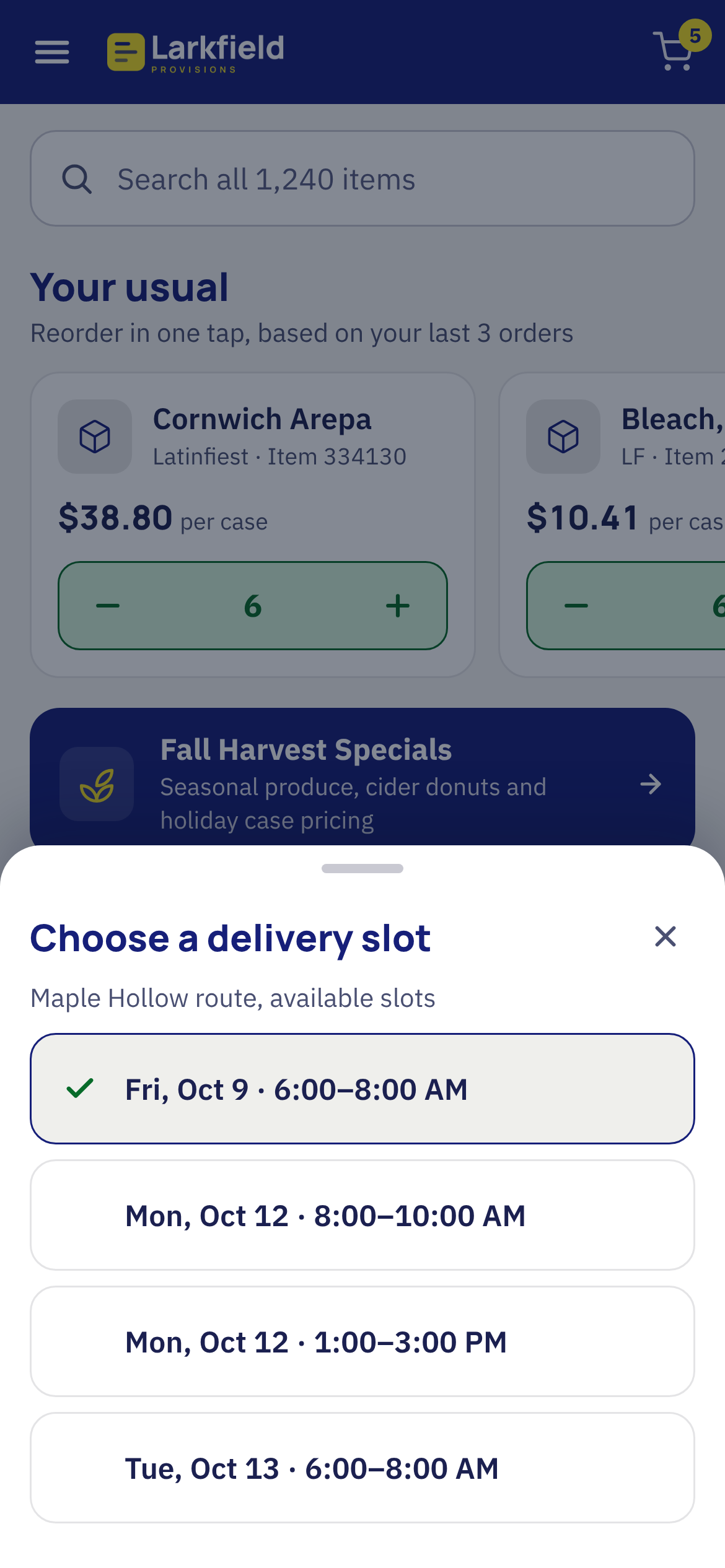
The delivery slot opens as a menu on desktop and a bottom sheet on the phone, with large options. A standing order repeats weekly or every other week. Out-of-stock items show the expected return date and a disabled “Unavailable” button.
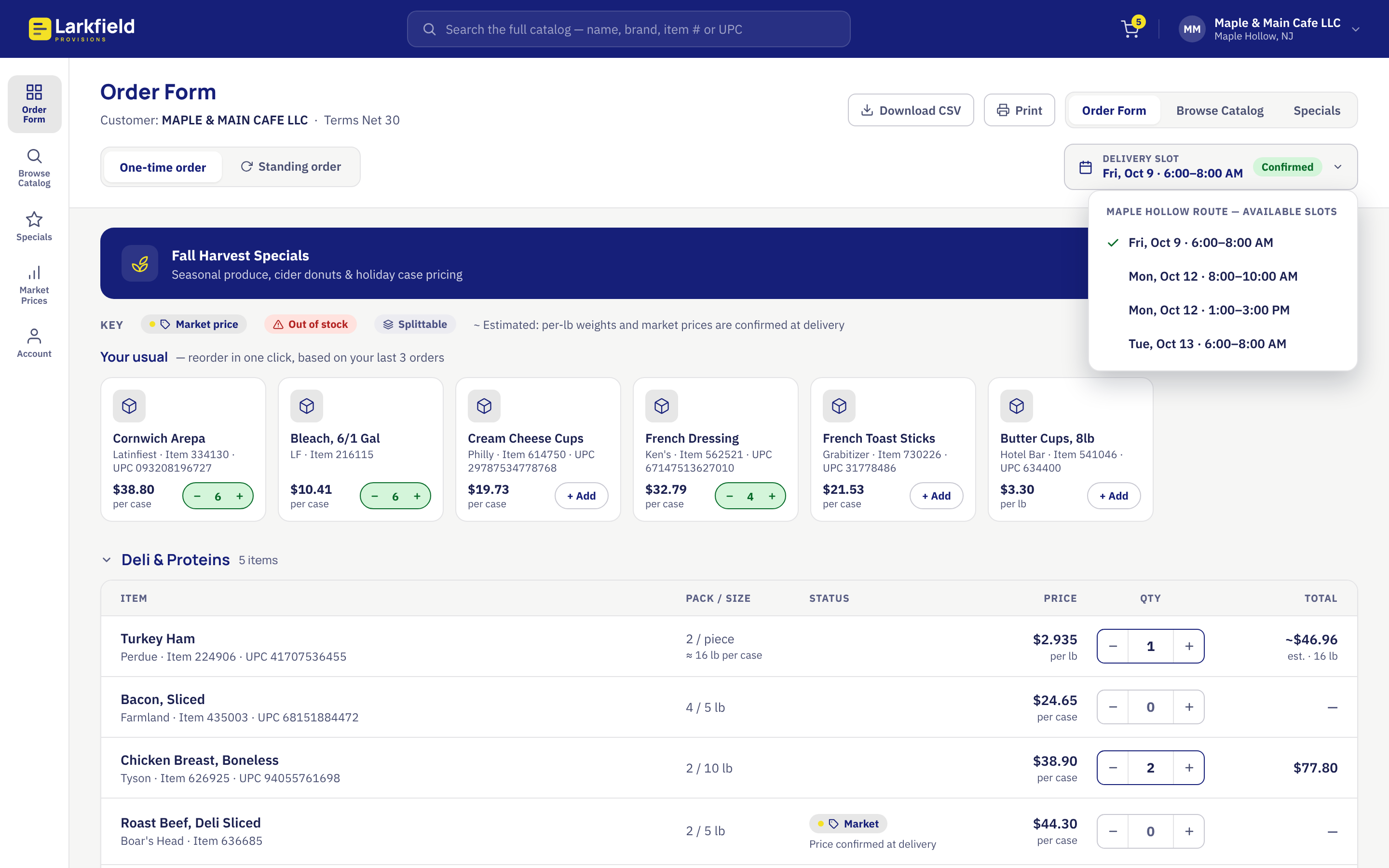
The delivery slot is a menu on desktop and a bottom sheet on mobile
Accessible From the Start
Every control works from the keyboard. Quantity changes and totals are announced to screen readers. Automated checks found no violations at nine screen sizes, from a 360 pixel phone to a 2560 pixel monitor.
Decisions & Tradeoffs
One Flow, Finished
The prototype covers the order form from start to confirmation. Browse Catalog, Specials, Market Prices and Account are not built. Their buttons say “Not in this prototype.” One complete path gives a reviewer more to judge than five half screens.
Estimates Shown As Estimates
A per-pound line could show a clean dollar figure that looks exact and turns out wrong at delivery. The form shows a tilde and the word “estimated” on every such line. The final amount depends on actual weights at delivery, and the form says so up front.
Tablets Share the Phone Layout For Now
A tablet gets the phone layout in a centered column. A proper tablet design belongs with the rep view in the next round.
Fictional Everything
Though I’m rebuilding an order system my company built for an actual client years ago, the distributor, the customer, the items and the prices in this interactive prototype are invented. The prototype carries a note saying so on every screen size.
Working With Claude
I set the direction and made each design call. Claude wrote the prototype code. We worked in a design canvas one layout at a time and I reviewed every version before the next one started.
Checks ran at each step. They covered keyboard paths, screen-reader announcements, accessibility audits and resizing across the breakpoint. Those checks caught a real bug: items added from a suggestion row did not change the subtotal, so a customer could add three items and see the same total.
My own testing caught what the automated checks missed. I loaded the phone version on my iPhone and confirmed the tap targets, the delivery sheet and the menu drawer. That test also exposed a gap below the sticky order bar that no desktop browser had shown. I flagged the shrinking desktop layout the same way, by using the page as a visitor would.
What I Would Do Next
Browse Catalog & Search Results
Discovery is the heart of this project and the full catalog view is the biggest gap. That will get built first.
A Rep View On A Tablet
The original process had a second user: the salesperson with the clipboard. A tablet is the closest modern device to that clipboard. The rep opens a customer’s account during a visit, reviews the usual order and places it on the customer’s behalf. The same screen shows what that customer has never ordered, which gives the rep something to talk about.
Try The Prototype
Open it on a phone or on a desktop. Drag the browser window narrower to watch the layout switch. Buttons that lead to screens I have not built say “Not in this prototype.”
This is a design concept by Tim Roberts. It uses a fictional distributor, a fictional customer and sample data. It is not affiliated with any real company.
frozen foods order system redesign with Claude – 2026