
Redesigning the Webster Bank App with Claude Design
An evolved brand and a working mobile prototype for the bank where I led Experience Design, built with Claude.
I led Experience Design at Webster Bank from 2017 to 2021. A cross-functional team proposed building the mobile app in-house and won internally against external bids. Leadership chose a vendor platform. The app still lives inside its limits.
This project asks what that app could be today. I extended a brand that was too narrow for digital, with full color ramps, a serif with character and colors that pass contrast. Then I prototyped four core flows with Claude.
Note: Webster didn’t ask for this, hasn’t endorsed it and I am not affiliated with them. Names, balances and account numbers on every screen are invented to keep real account details private. Rates and fees on the redesigned screens are illustrative.
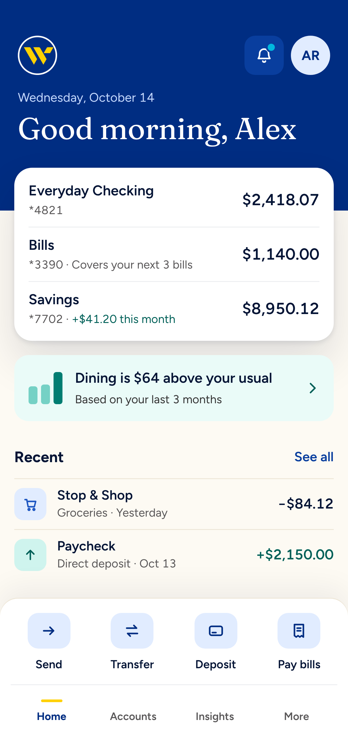
Home greets you by name, with every balance, one insight and recent activity on a single screen.
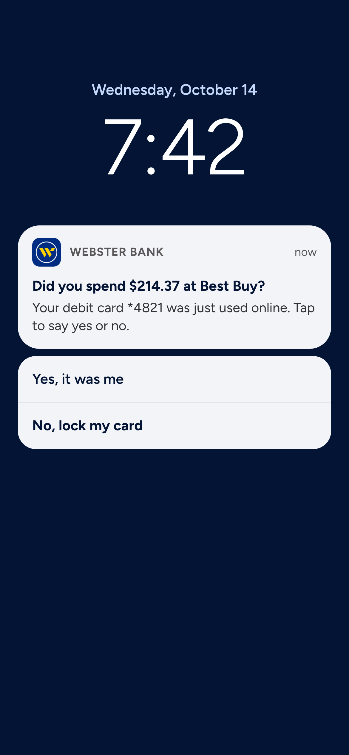
A fraud alert you can answer right from the lock screen.
Why Would Anyone Choose This Bank On Purpose?
I still bank at Webster, mostly out of inertia. The accounts came with the job. Nothing in the app has given me a reason to stay or a reason to leave.
That’s how banks lose people now. Nobody storms out over a fee. They open a Chime account for one thing, a budgeting app for another and the bank slowly becomes the place their paycheck lands before it goes somewhere more useful.
My own accounts tell the story. I have accounts nicknamed “Bills” and “Food.” I built a budget out of extra accounts because the app gave me nothing else to work with. Every one of those transactions already passes through the bank. The app hands them back exactly as the card processor sent them: all caps, truncated and barely readable, like WEB TXFR TO DD 0000*3390. Nothing groups them or shows where the money went.
That data could be doing real work. At Webster I pushed to turn it into insights, so the app earns a visit even when nothing is wrong. My team’s website rebuild proved that a better experience moves real numbers. Application starts rose 600% and home equity revenue grew by $4.5M. This concept asks what the same thinking would do inside the app.
The App Today
The current app does the basics and stops there. Account data on these screens has been anonymized.
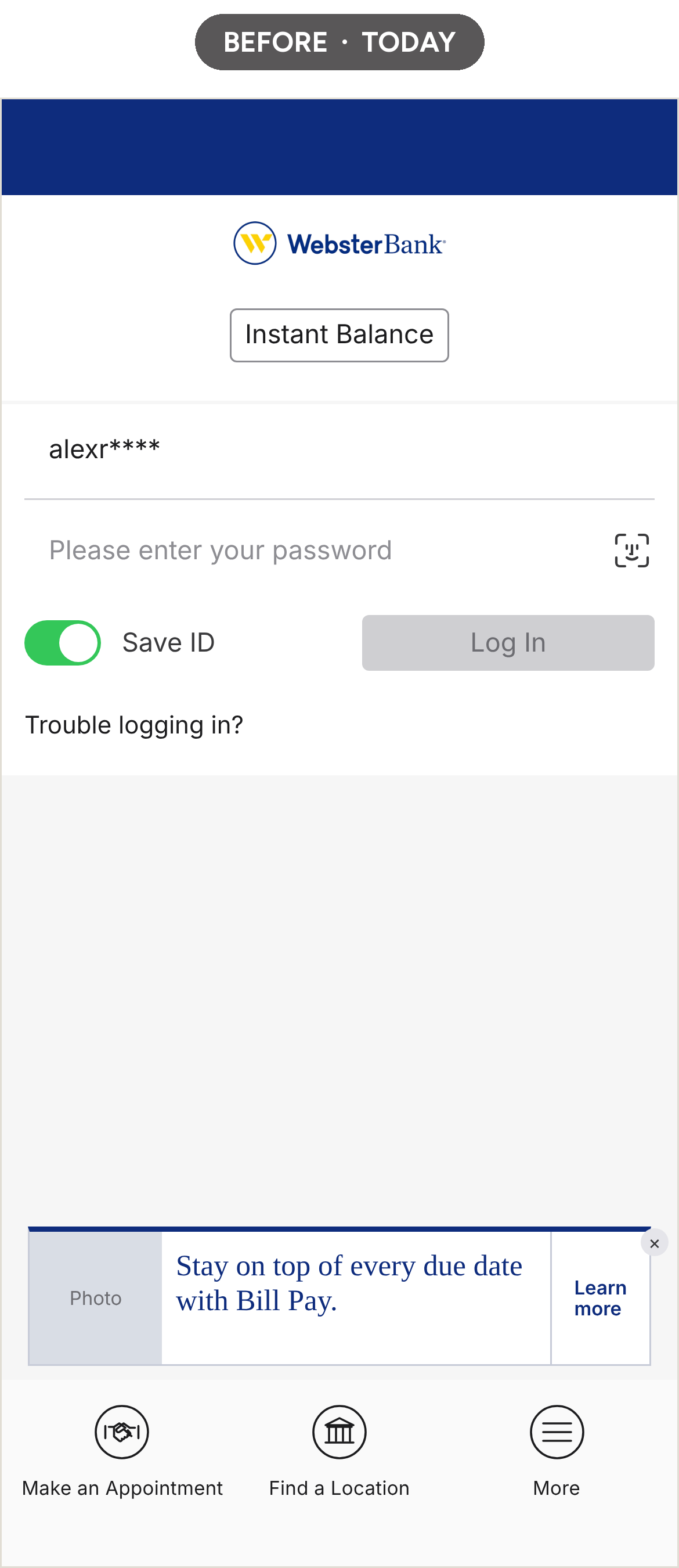
Login
The most prominent button on the screen is Instant Balance, a feature Face ID has made mostly redundant. Face ID itself is a small icon tucked inside the password field. Log In sits greyed out until you type. The thumb zone at the bottom goes to Make an Appointment and Find a Location, with basic alignment issues with those buttons. A promotional banner fills the space in-between.
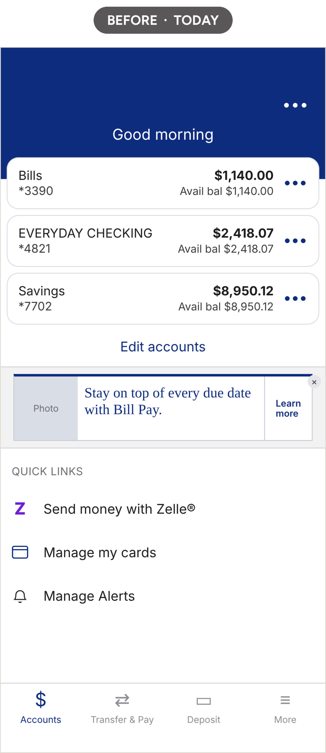
Home
The greeting says “Good morning” without a name. Each account card shows the balance, then shows the same number again as “Avail bal.” A Bill Pay ad takes the middle of the screen. Below it, Quick Links is a plain list of three items. There are no recent transactions and nothing that suggests the app knows who you are.
Account Detail
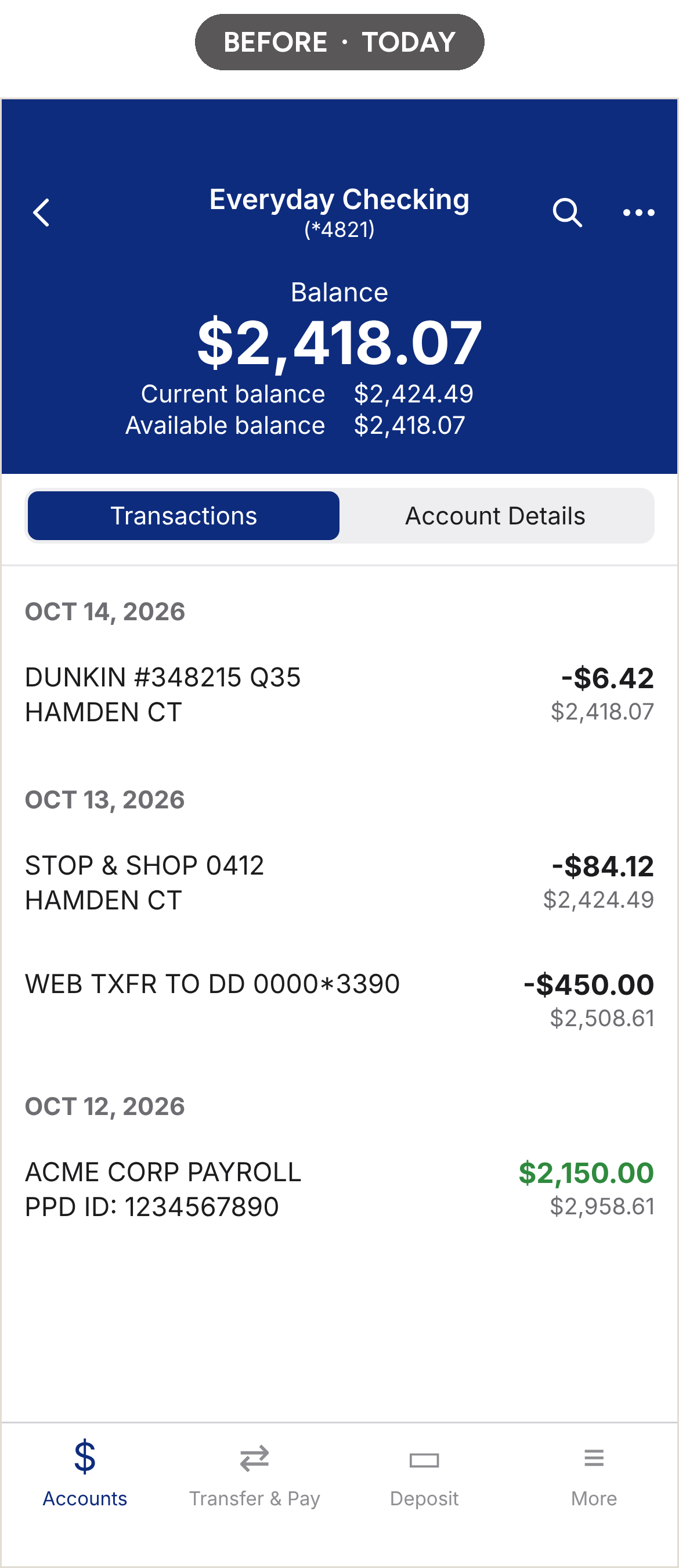
The same balance appears three times at the top. Transactions use raw processor descriptors like WEB TXFR TO DD 0000*3390. A running balance sits under every amount, which helps reconcile a checkbook and adds noise for everyone else.
What The Screens Don’t Show
You can’t open an account in the app. Card controls live deep in a long settings list. “Delete an account” sits right below “Manage my cards.” Alerts exist only as settings. Even the blue has drifted from the brand’s #002d82 to #0e2c7d.
None of this comes from careless people. Banks ship carefully. Most of these choices trace back to a vendor platform, a compliance review or a feature that made sense in 2015.
The point of a concept is to ask what the app could be if those decisions were made again today.
Four Principles
I started with a long list: thumb zones, essentials first, progressive disclosure, biometric login with friendly fallbacks, no premature validation, disclosures that hide nothing. It boiled down to four.
| Principle | What it means | Where it shows up |
|---|---|---|
| Say it like a person | Plain words. Cut until the meaning starts to slip. | “Dining is $64 above your usual” in place of a category report |
| Reassure first | Money moments are tense. Lead with what’s safe and what happens next. | The card lock screen says the new card is ready before anything else |
| Earn the next visit | Give people a reason to open the app when nothing is wrong. | Insights on home, a bills forecast that spots a shortfall early |
| Show the work | Any number the app infers comes with how it got there. | “How we worked this out” on the dining insight |
Evolving the Brand
I didn’t throw out the 2020 brand. I helped bring it to digital. Its bones are good. The problem is range.
The guide gives you Webster Blue, a yellow, a gray, Roboto and Source Serif Pro. Sky blue and green exist but come with narrow usage rules. Designing a dense app with blue, yellow and 50% gray is hard. I argued for an elegant serif and a real secondary palette back then and got a fraction of it. This time, I could follow the argument through.
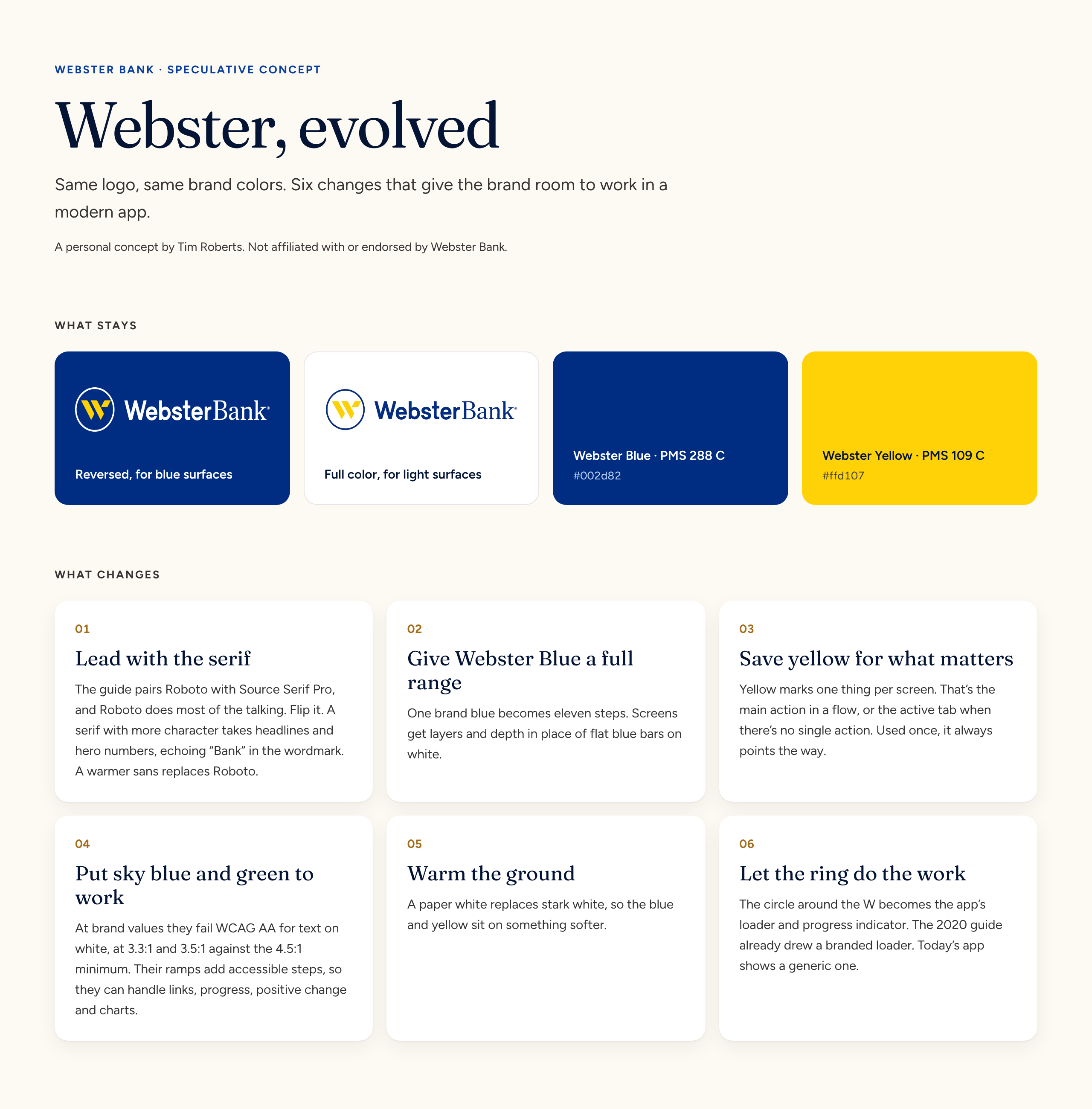
Webster Bank brand, evolved: What stays, what changes and the six moves behind the evolution.
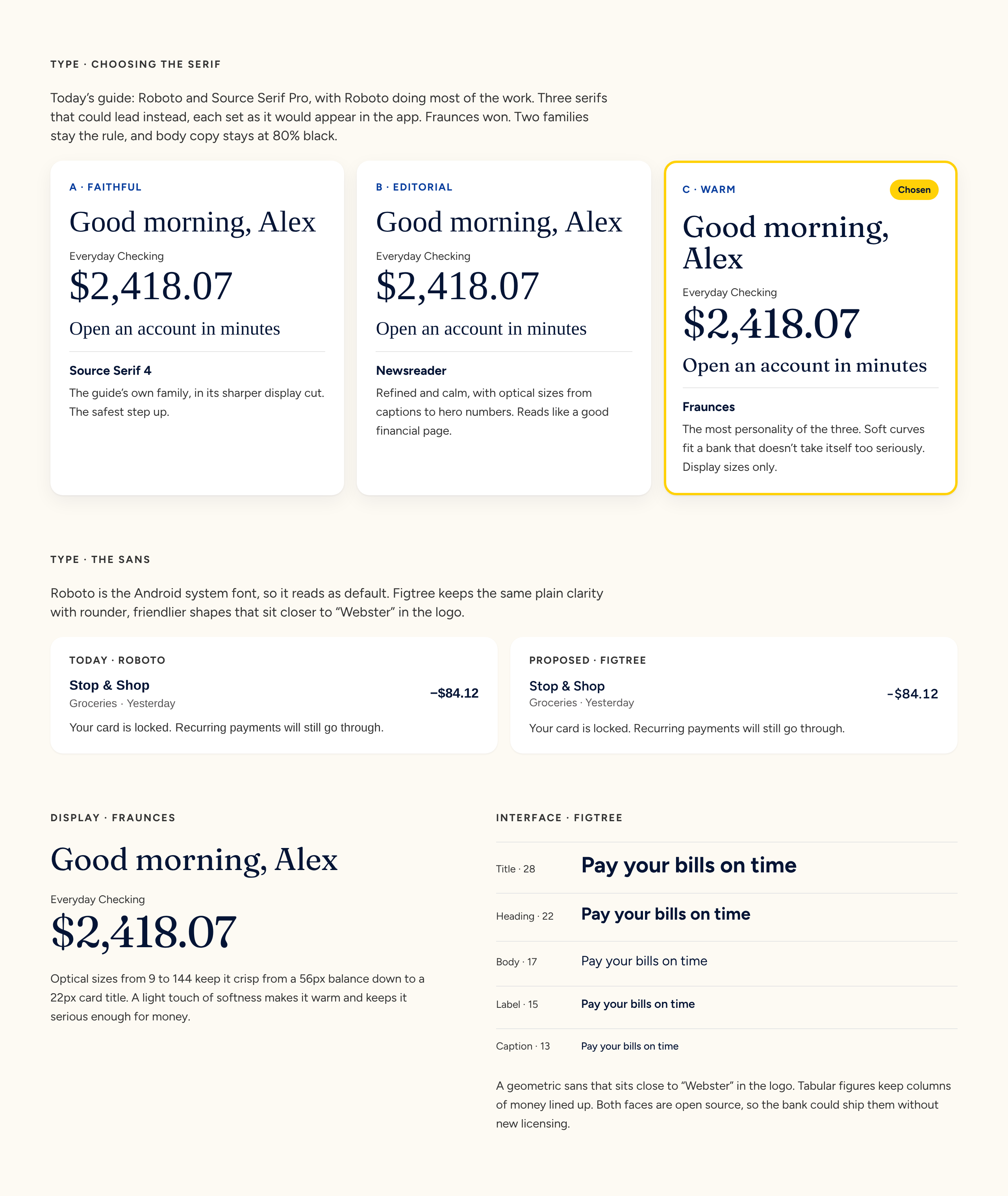
Typography: Fraunces leads the headlines. Figtree replaces Roboto for everything else.
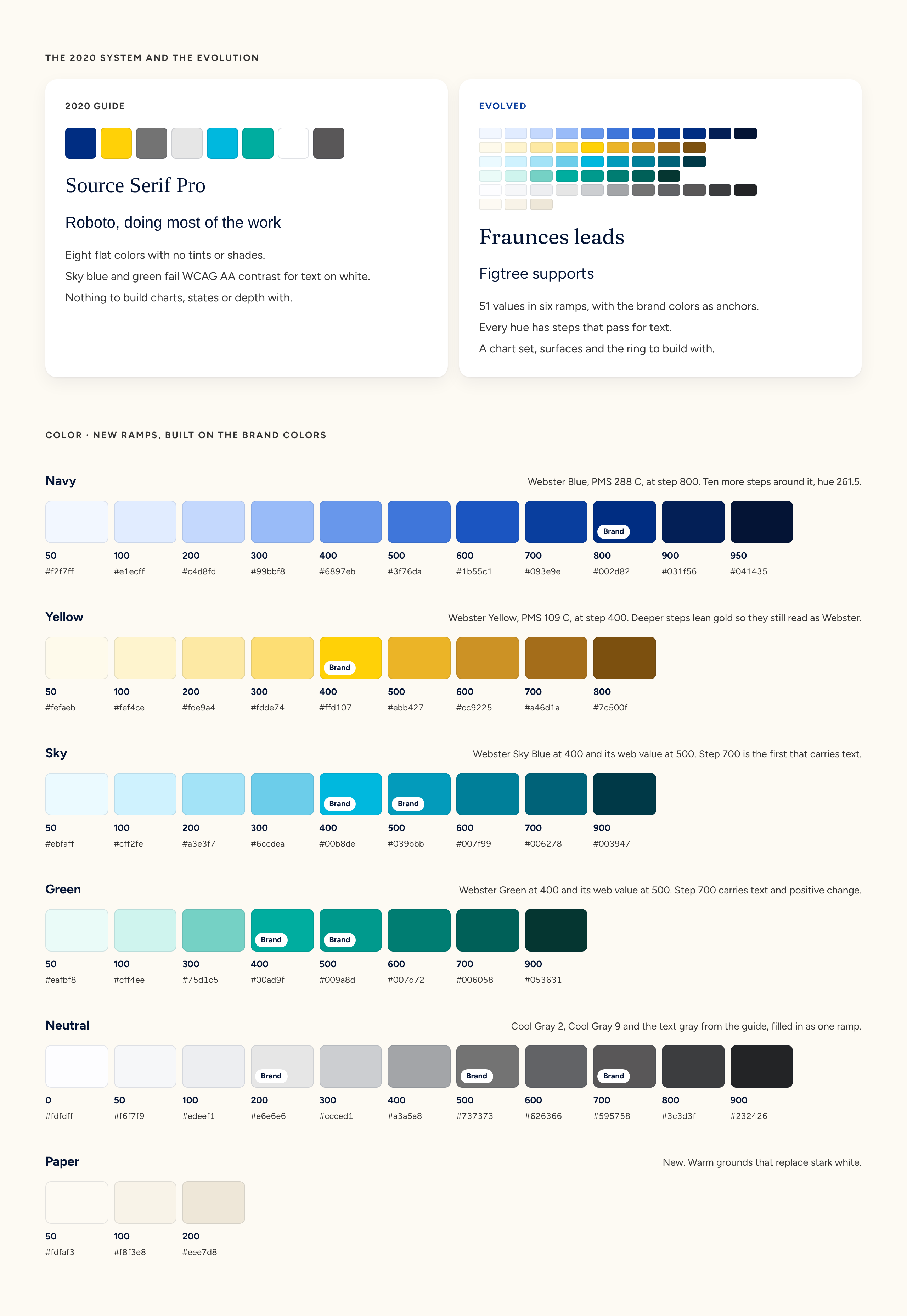
Color ramps: OKLCH color ramps built from the official Webster hues, with darker steps that pass contrast.
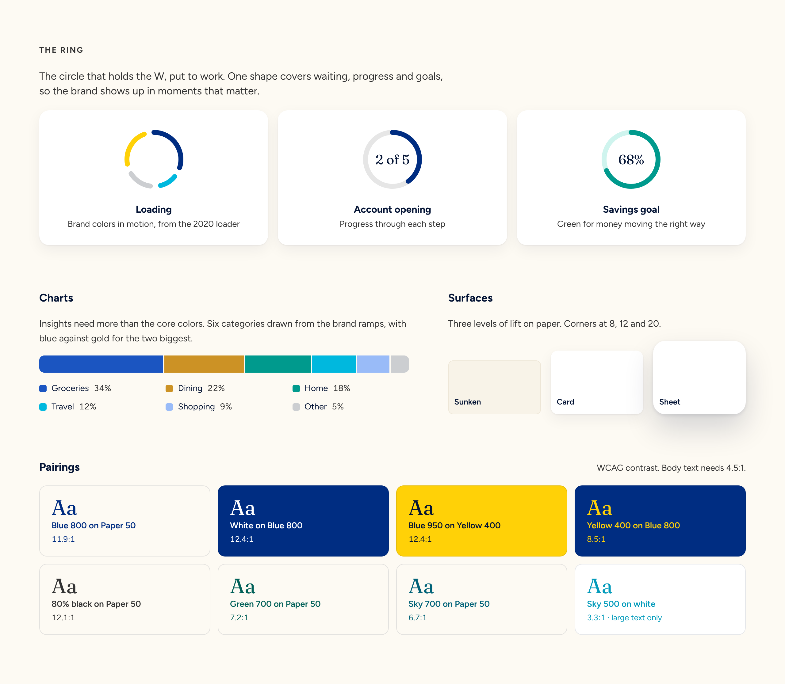
The ring as loader and progress, plus chart colors, surfaces and accessible pairings.
Login & Home
The app should know who you are the second it opens and show you what changed since your last visit.
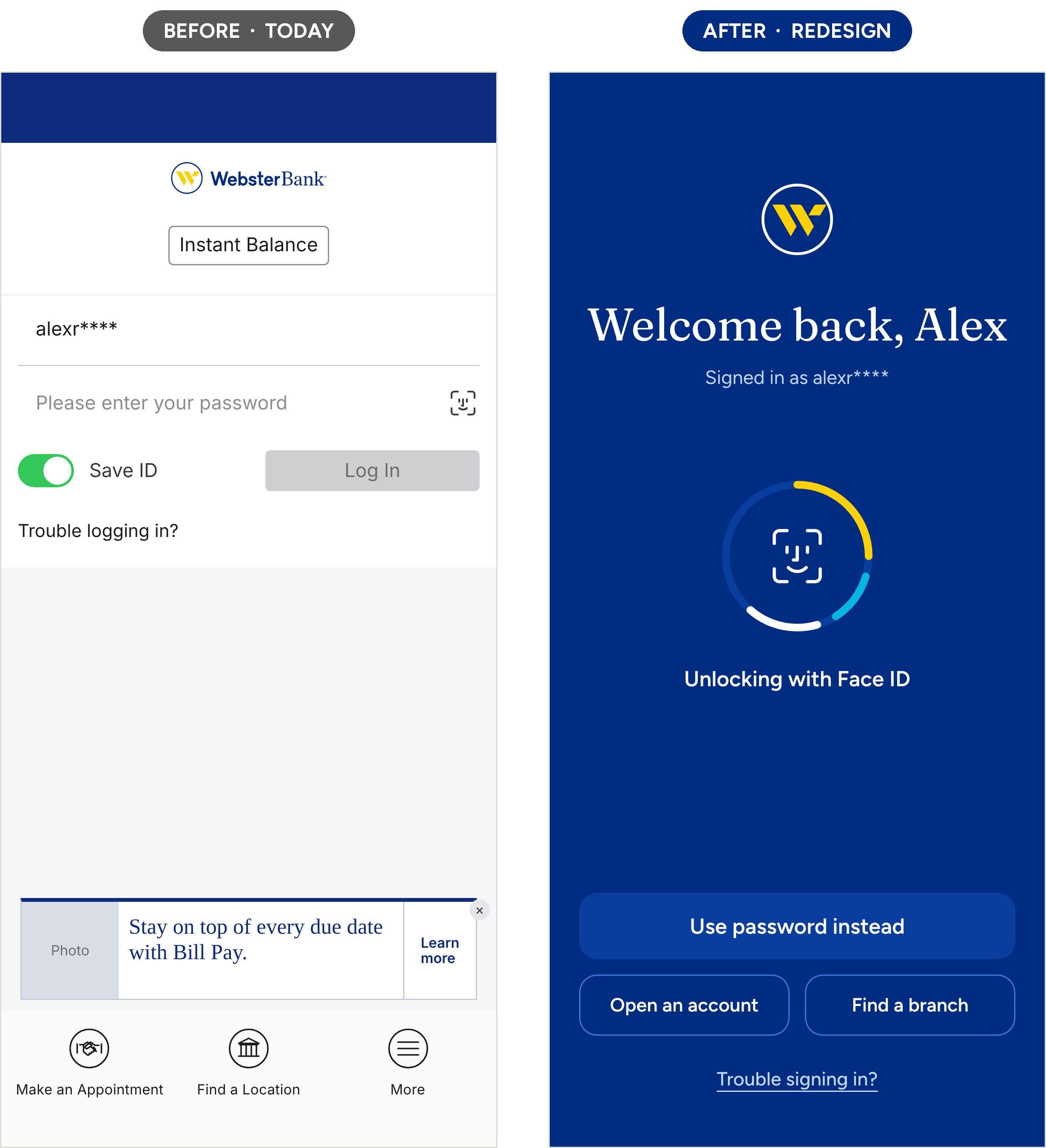
The New Login
Face ID starts on its own, inside the brand ring that spins while it works. The screen greets Alex by name. A password fallback sits in the thumb zone as a full-width button, with “Open an account” and “Find a branch” below it. Instant Balance is gone. With Face ID this fast, it no longer earns a spot, though it could return as a lock screen widget.
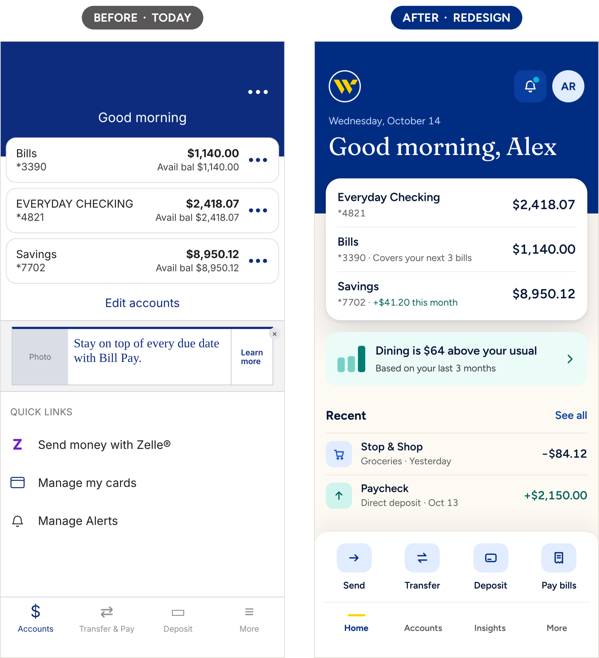
The New Home
The greeting uses your name and the date. Accounts sit on one card that overlaps the navy header, with the last four on every account and one balance each. Bills shows “Covers your next 3 bills.” Savings shows what it gained this month. One insight card follows, then recent transactions with clean merchant names and categories. Send, Transfer, Deposit and Pay bills sit right above the tab bar where a thumb lands.
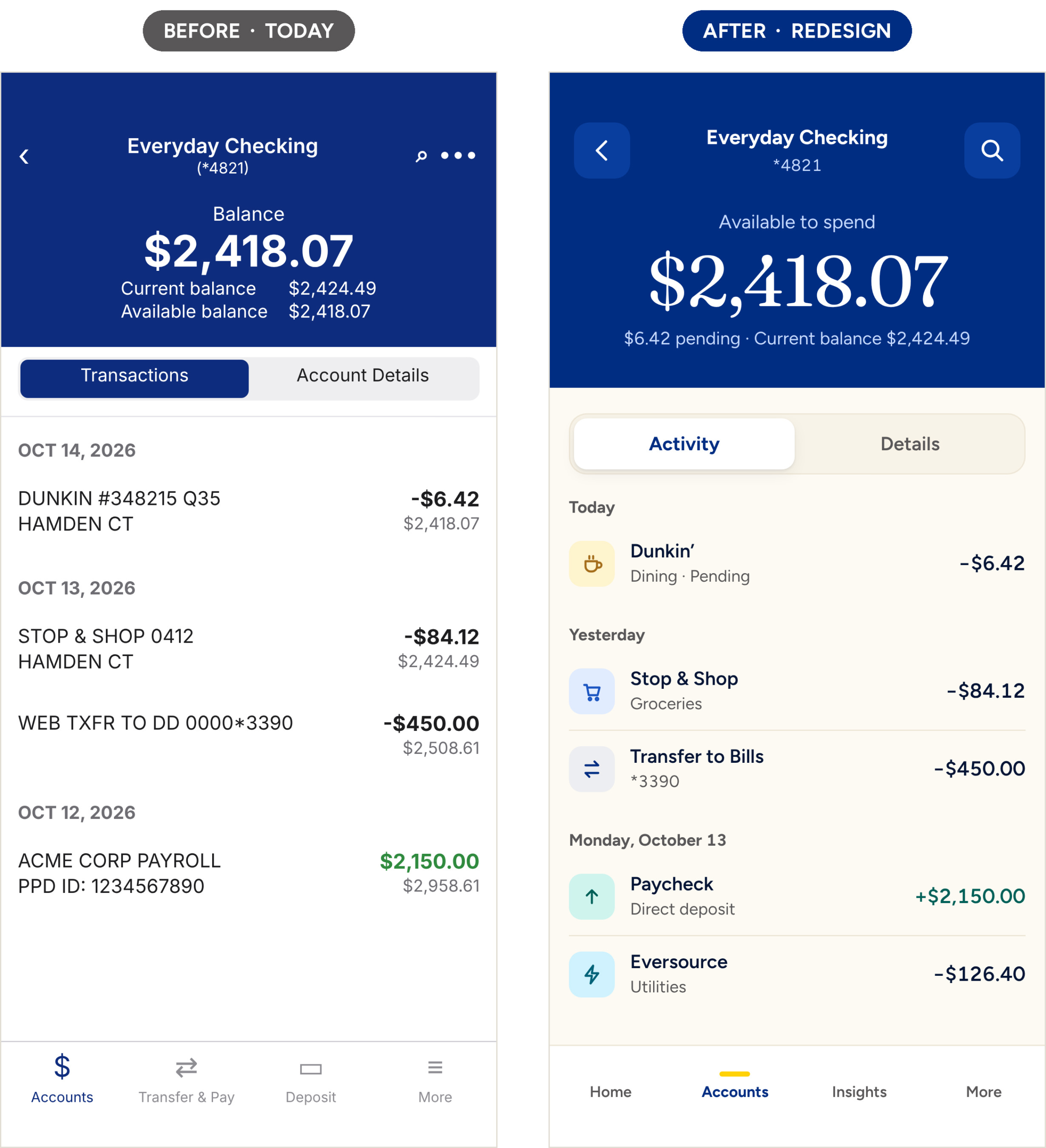
The New Account Detail
One balance, set large in the serif, labeled for what it is: available to spend. Pending and current balances sit in a single line below. Transactions get icons, merchant names and categories, grouped by day.
In-app Account Opening
The biggest gap in the app is that you can’t open an account in it. On the website, my team’s redesigned application flows drove a 600% increase in application starts. The app should be the easiest place to open one.
There are two paths, because a stranger and an existing customer need very different amounts of proof.
New Customers: Five Steps
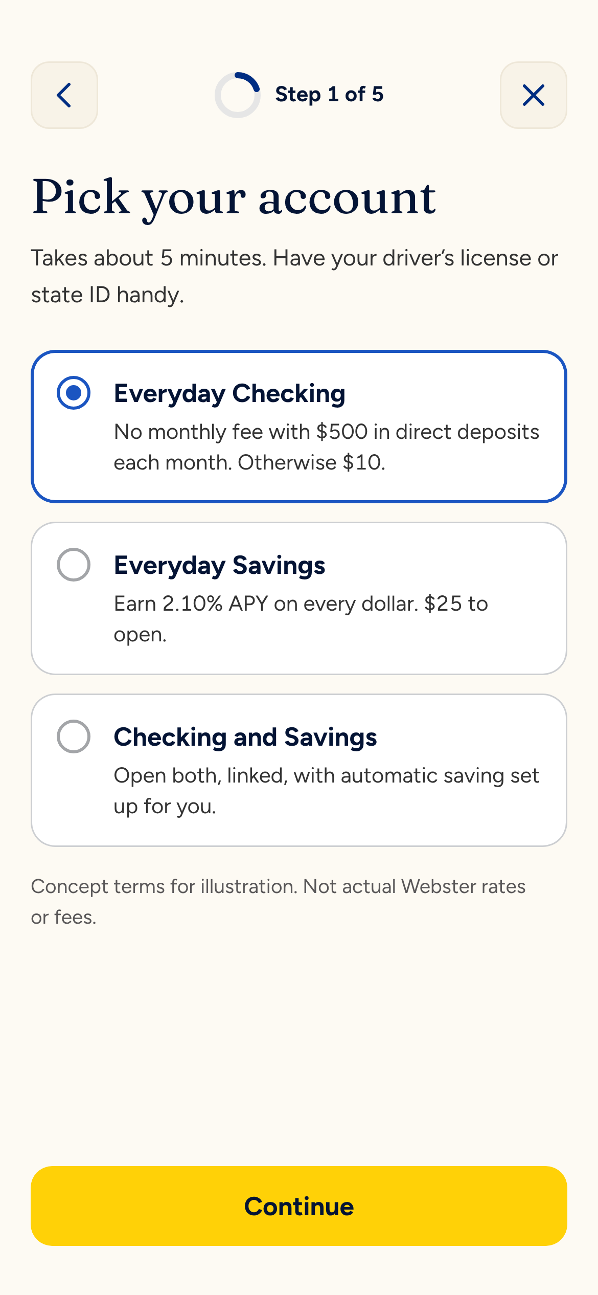
Pick checking, savings or both.
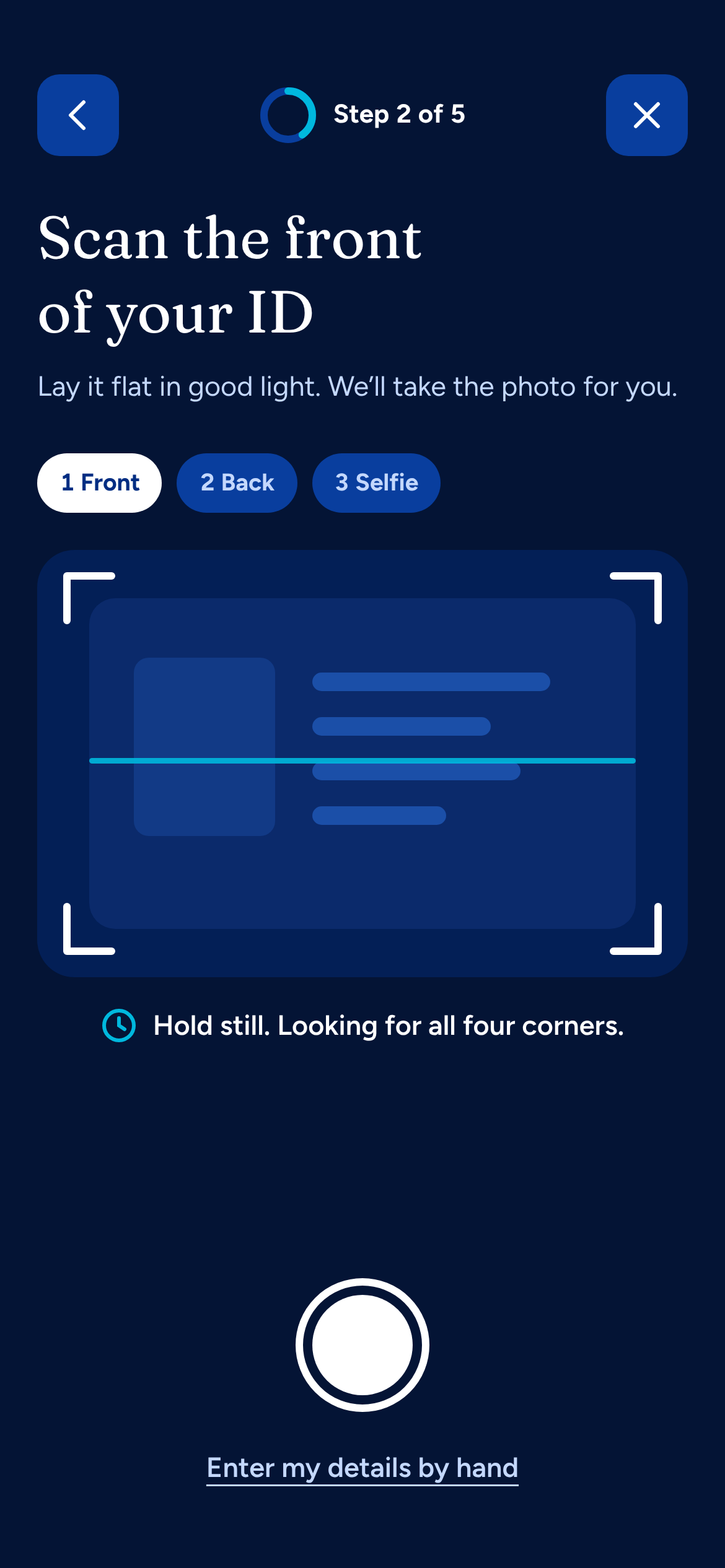
Scan an ID. The camera does the typing.
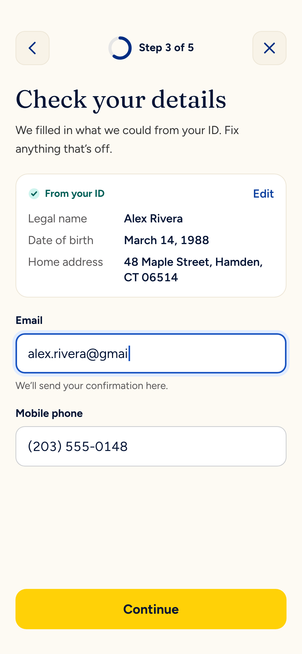
Details prefill from the ID. Only email and phone are left.
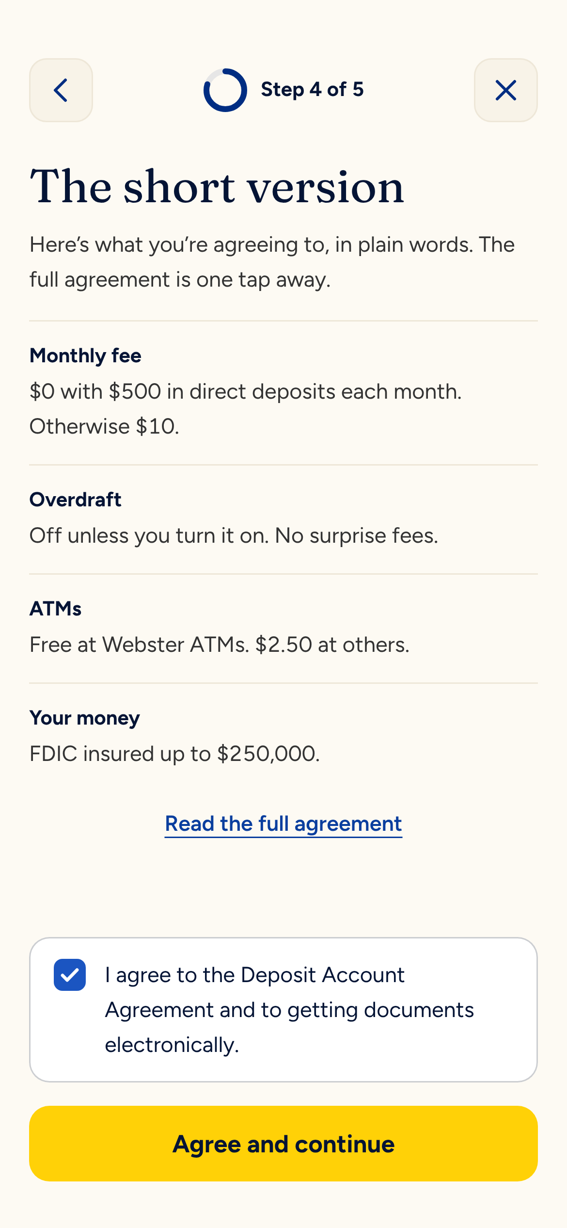
Fees, overdraft and FDIC coverage in plain language. One checkbox.
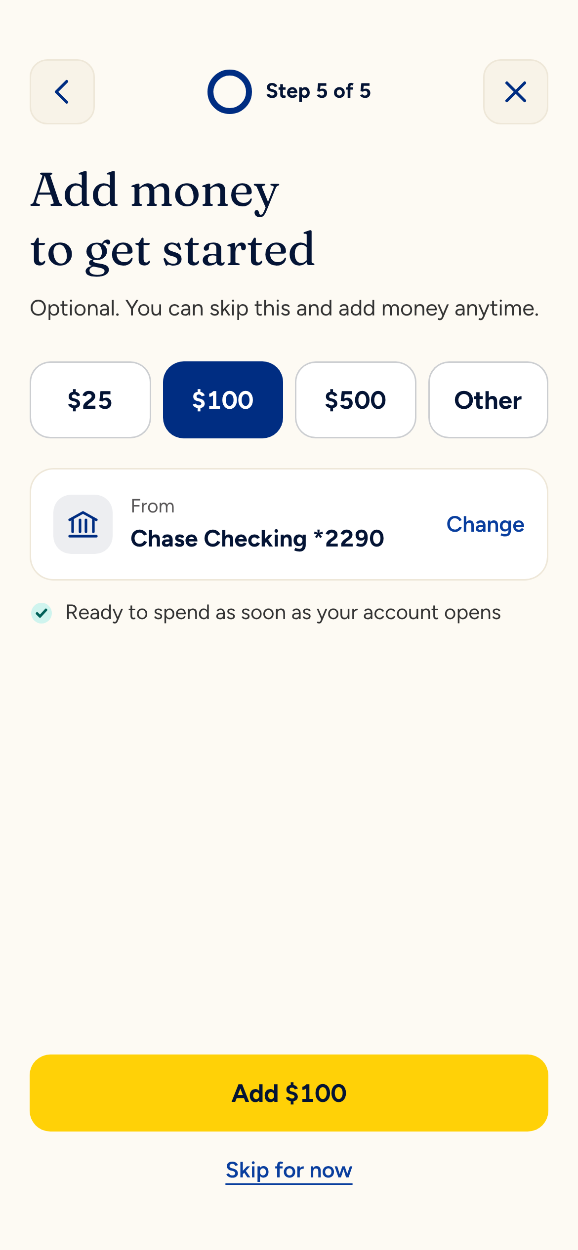
Suggested amounts make the first deposit a single tap.
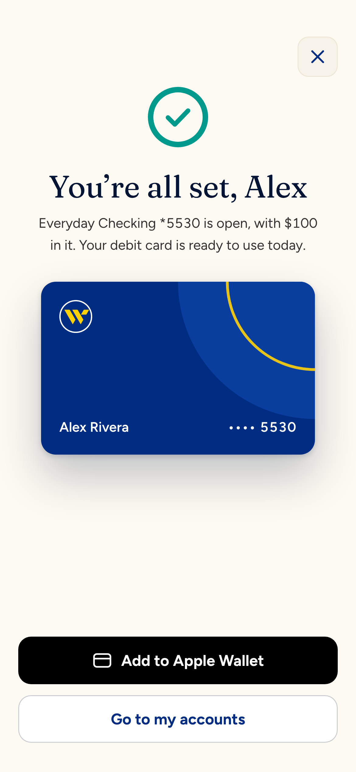
Done, with the debit card ready for Apple Wallet.
Existing Customers: Three Steps
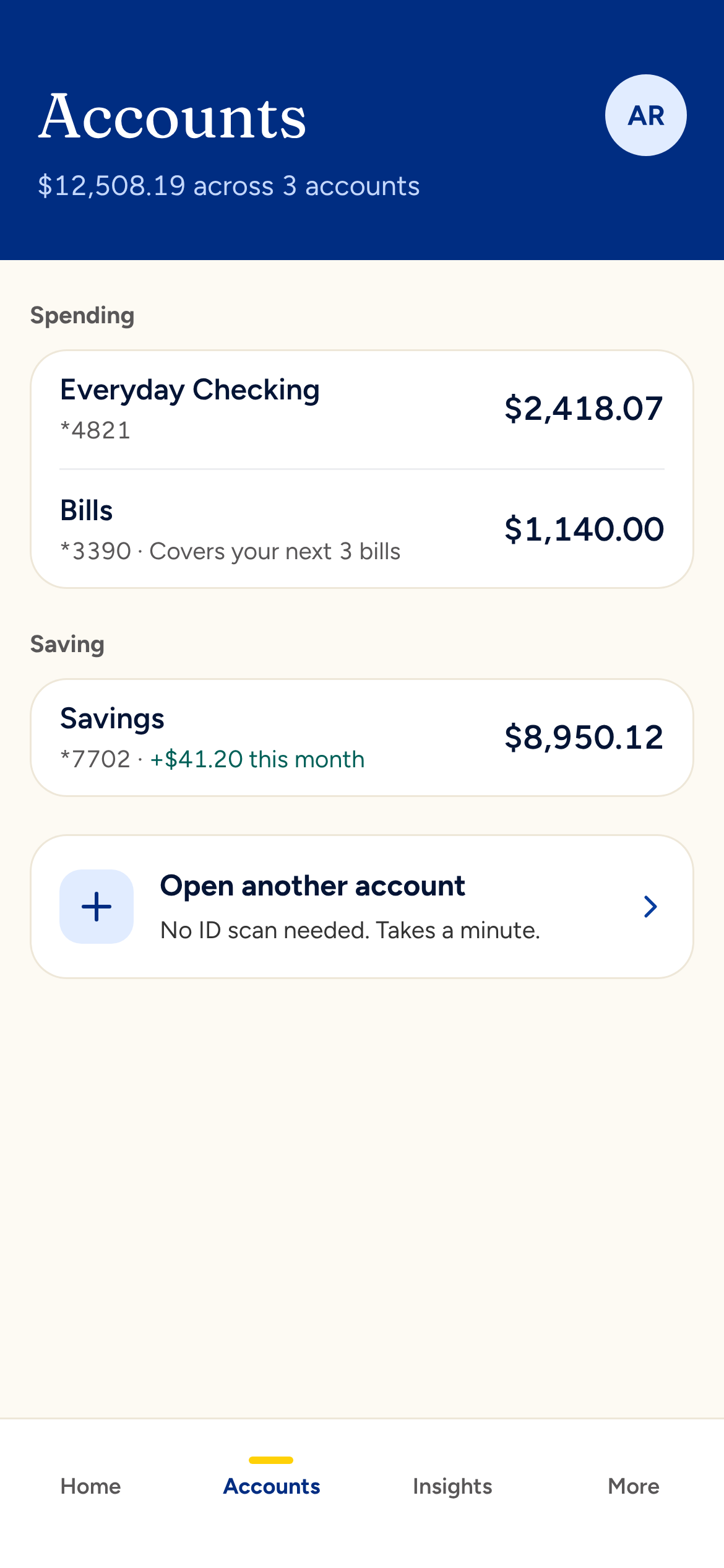
Open another account from the bottom of the Accounts tab.
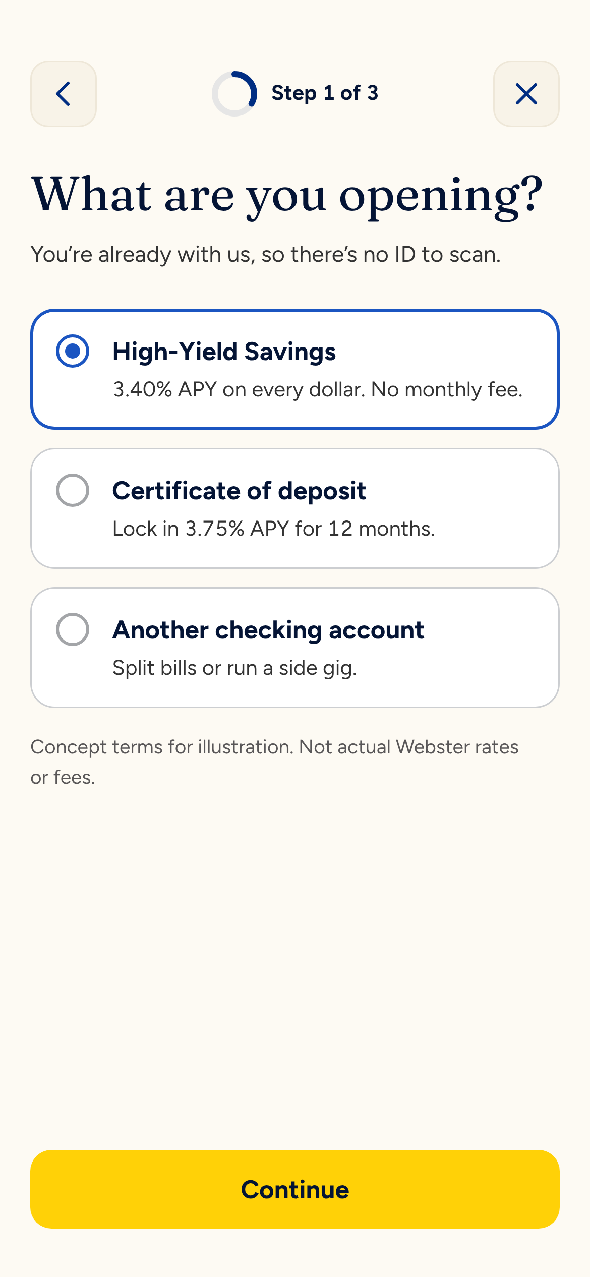
No ID scan. Alex is already verified.
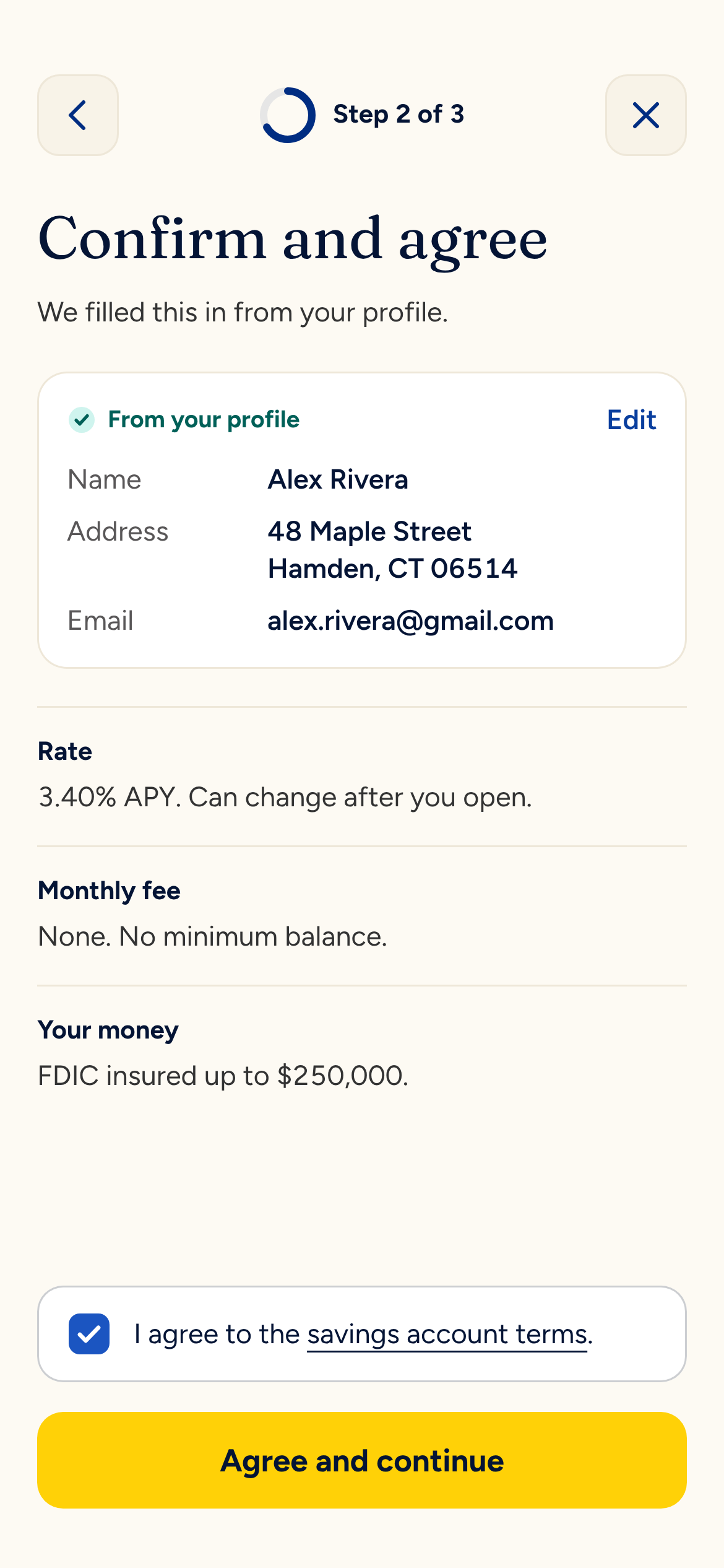
Profile details carry over. Three terms, one checkbox.
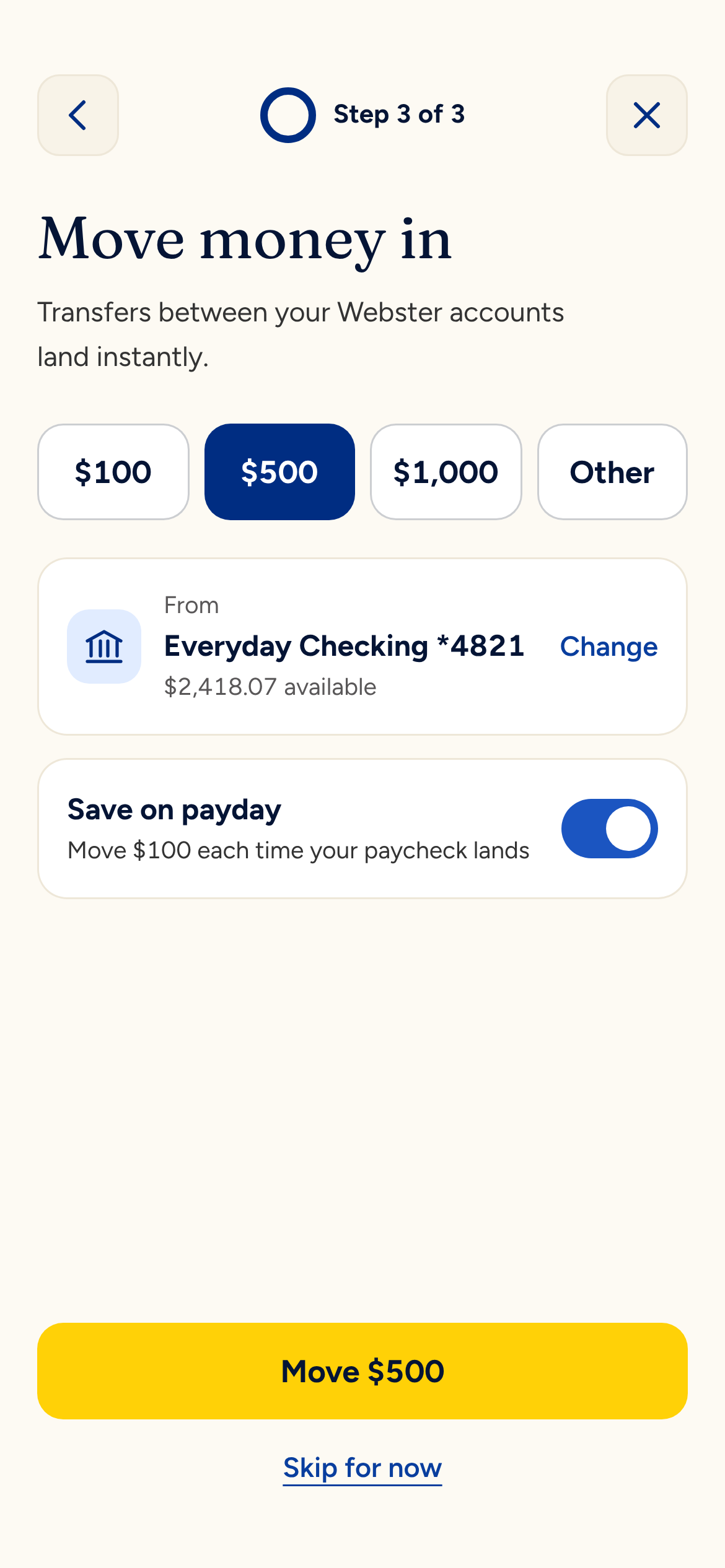
Move money in and turn on Save on payday.
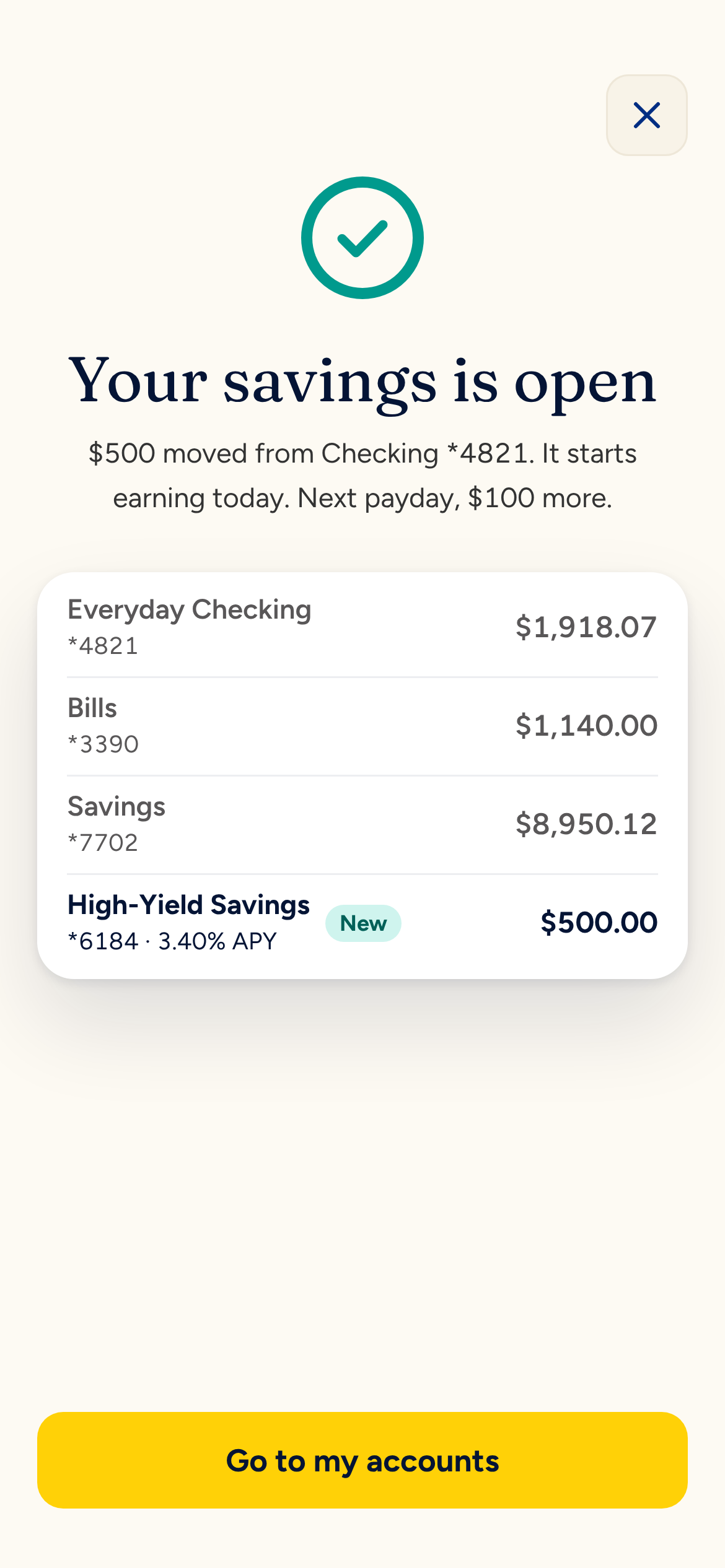
The new account shows up in the list, marked New.
Alex is already verified, so asking for an ID again would be theater. The way in is a new Accounts tab, which groups accounts as Spending and Saving and ends with “Open another account.”
- Pick. High-Yield Savings, a CD or another checking account. The subhead says up front that there’s no ID to scan.
- Confirm and agree. Name, address and email come from the profile. Three plain terms and one checkbox.
- Move money in. An instant transfer from checking, plus a “Save on payday” switch that moves $100 whenever a paycheck lands.
The done screen shows the new account in the list with a New badge. Checking already reflects the transfer. In the prototype, the account appears in the Accounts tab after you finish.
This is the flow most likely to answer the question I started with. A savings account that saves for you on payday is a reason to keep your paycheck here.
Insights
This is the feature I fought for at Webster. The bank sees every transaction, so it can tell you something useful before you think to ask.
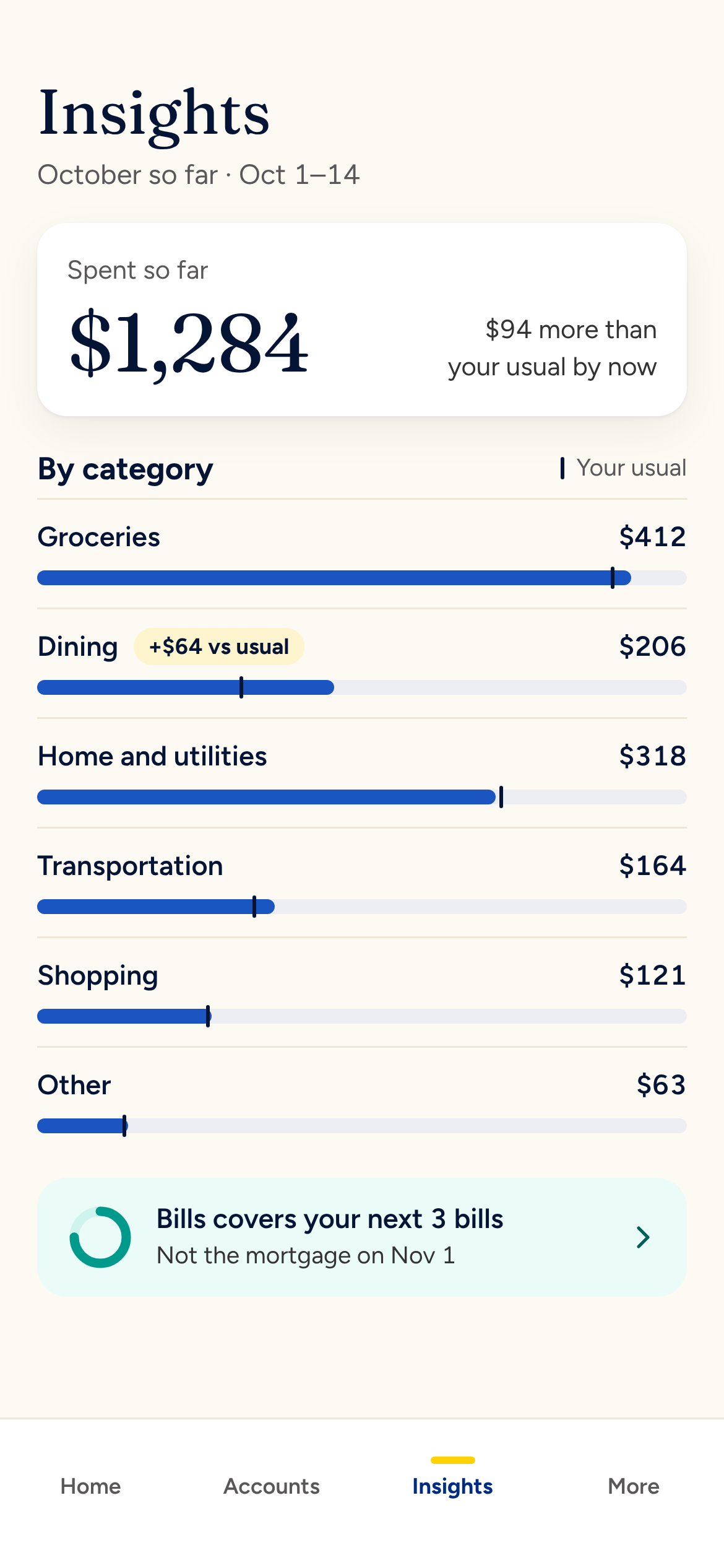
Overview
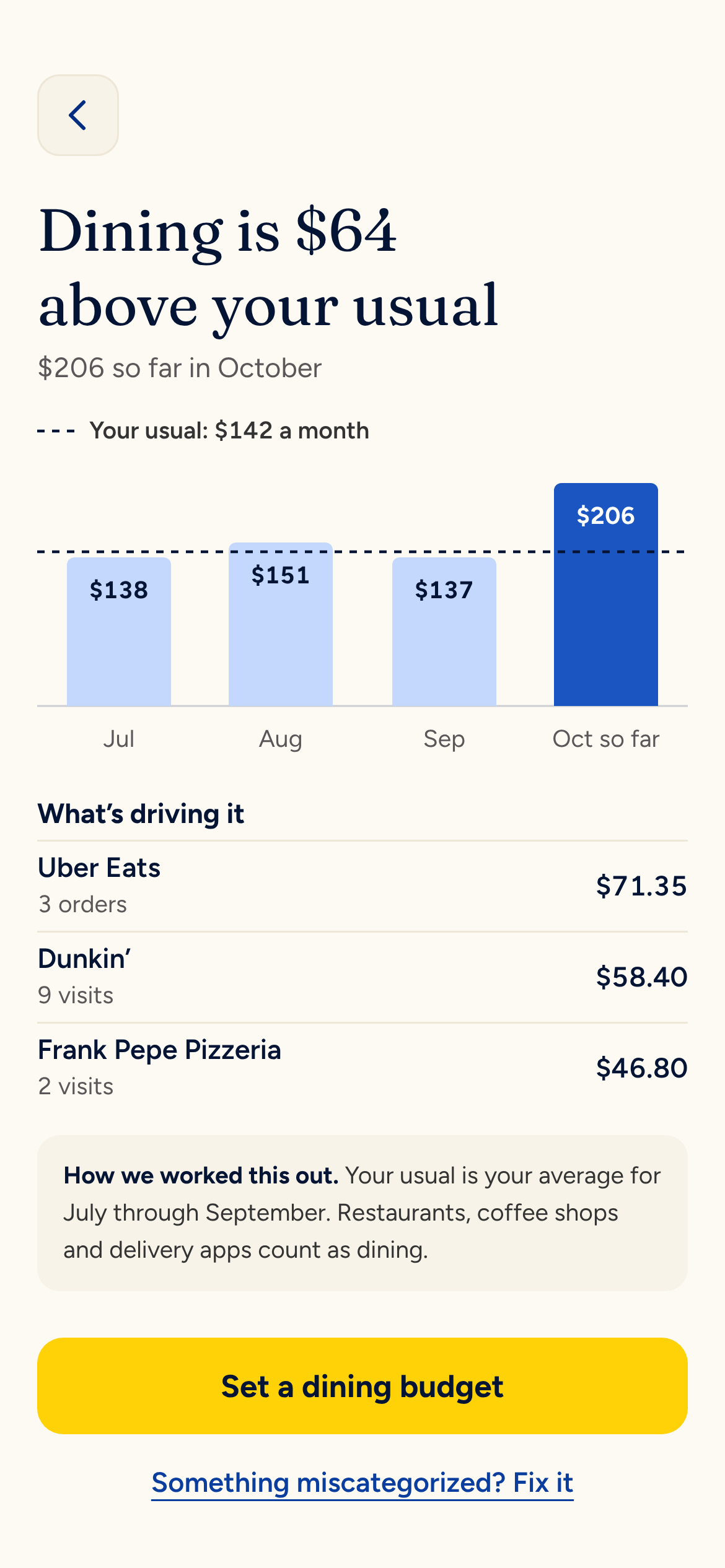
October spending is $1,284 against a usual $1,190. Six categories each show a tick for your usual amount, so you can spot the outlier without reading numbers. Dining is labeled +$64 above usual.
Dining Detail
Four months of dining as bars, with your usual as a dashed line and a legend that spells it out. Values sit inside the bars so no label fights the line. Below, the top drivers explain the jump. “How we worked this out” shows the math. One action closes the screen: set a dining budget.
Bills Forecast
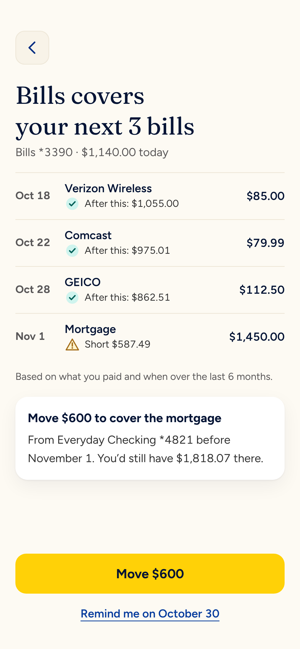
A timeline of what’s due over the next few weeks. The mortgage is flagged as $587.49 short, with the basis for that forecast on one line. The fix is offered right there: move $600 from savings.
The engine behind all three is simple arithmetic on data the bank already holds, said back in one sentence. Every chart pairs color with a label or pattern, so nobody depends on telling teal from navy.
Card Management & Fraud
A suspicious charge is the most stressful moment a bank app handles. It’s also the best chance to earn trust, and the cheapest way to keep a call out of the contact center.
The Alert
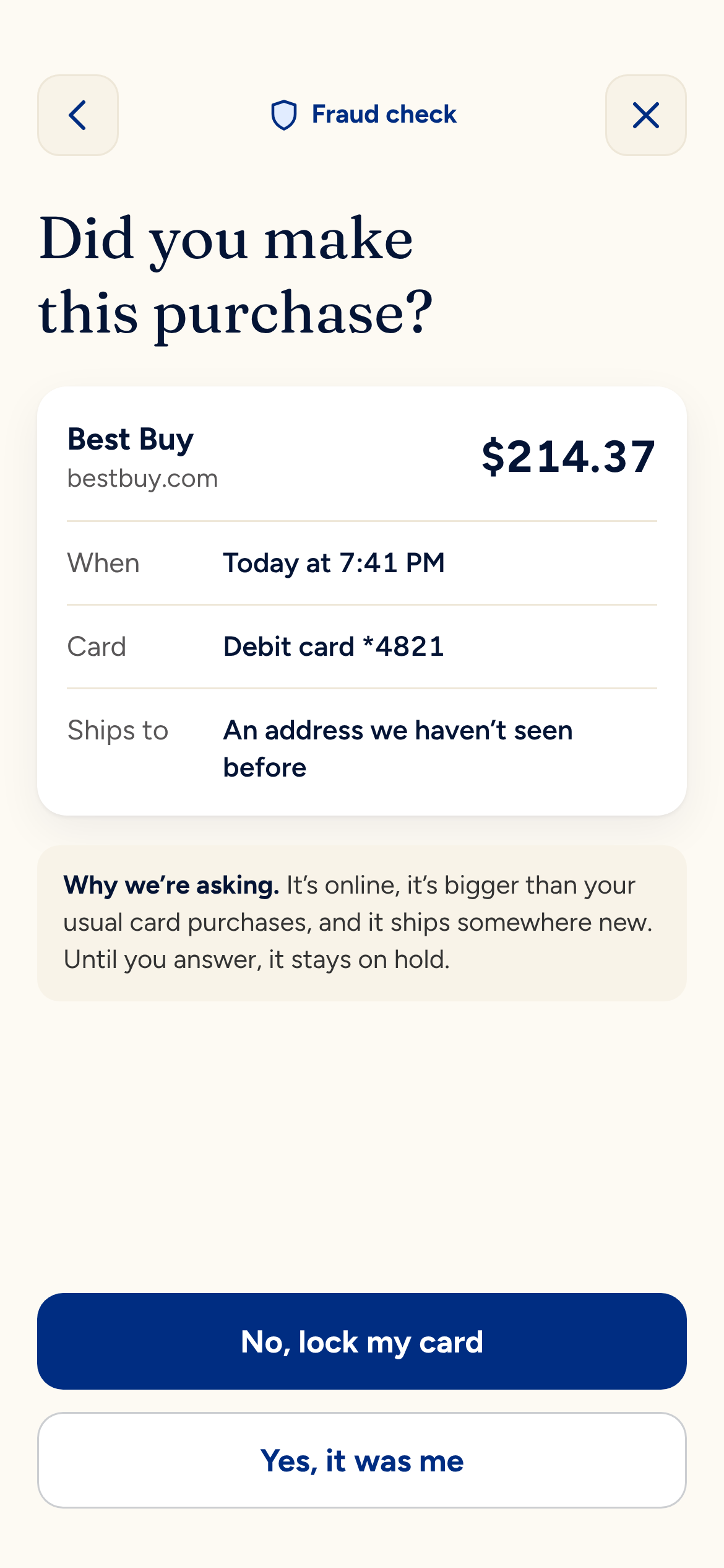
A lock screen notification asks one question: “Did you spend $214.37 at Best Buy?” You can answer from the notification. “No, lock my card” locks it on the spot. “Yes, it was me” approves the charge and thanks you.
The Check
Opened in the app, the same question gets context and a short “Why we’re asking.” The two answers carry equal weight and neither one is yellow. In a fraud check, the bank shouldn’t nudge you toward either answer.
Card Locked
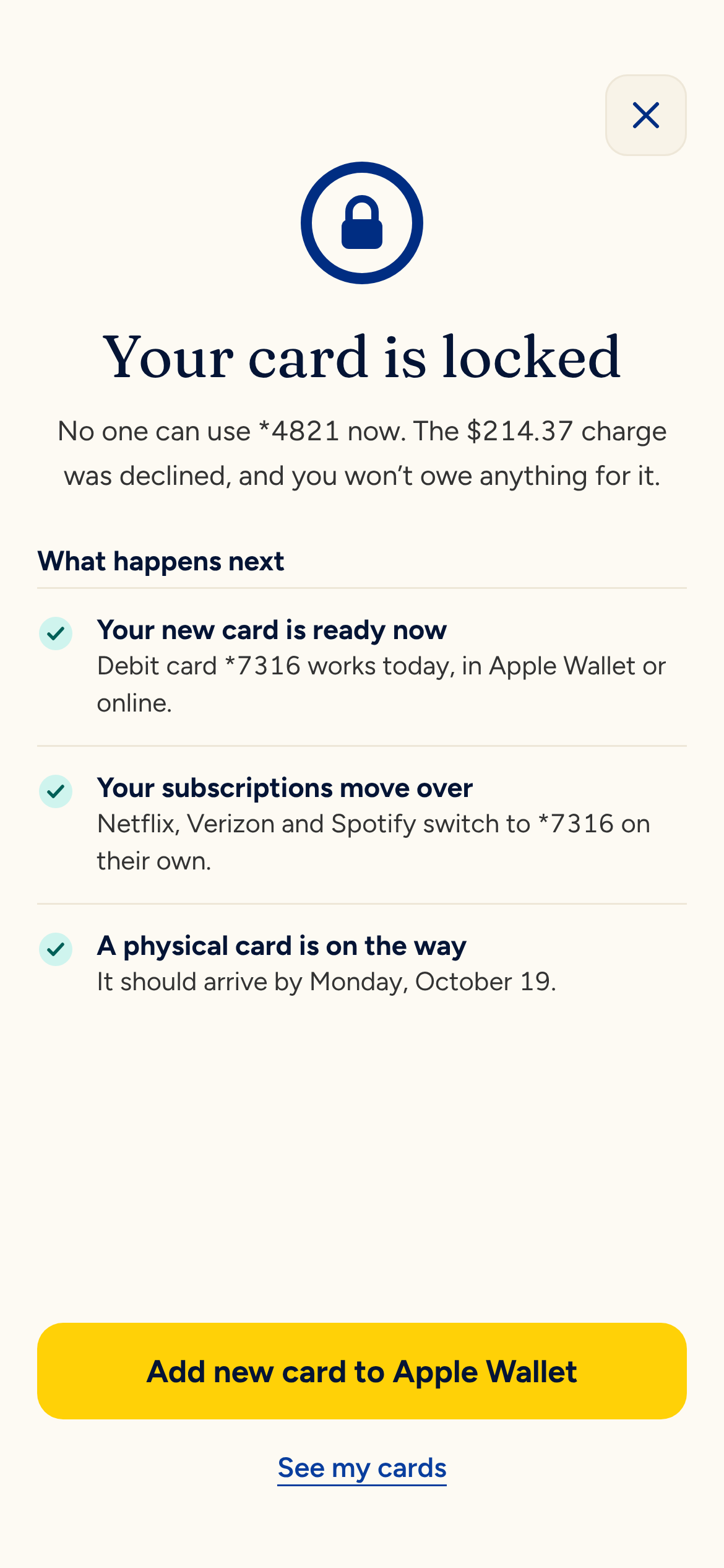
The screen opens with what’s already handled: the declined charge, a new card (*7316) ready to use right now and subscriptions that will move over. The physical card arrives by October 19.
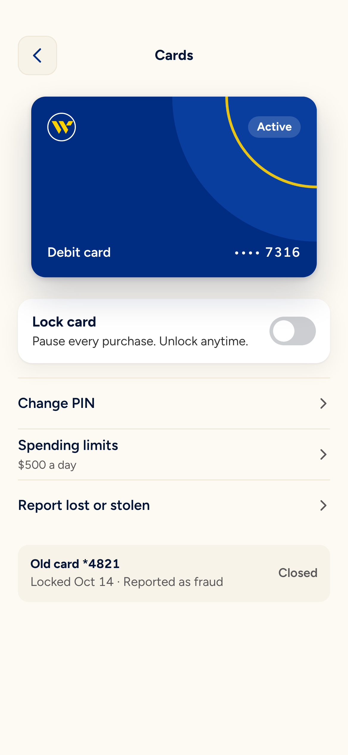
Cards
Every card in one place, with a lock switch that works in the prototype. Card controls move out of the settings list and into a screen of their own.
How I Built It
I made this with Claude as my production partner. I set the direction, the brand moves and the craft bar. Claude built the boards, the screens and the prototype. I reviewed every round on desktop and on my phone.
That split kept my time on the decisions and the details. A few of the rules I held the work to:
- Every line height lands on a 4px grid in whole pixels.
- Like items get like type. Balances in lists stay in the sans. The serif is saved for a single hero number.
- Every account shows its last four with an asterisk (*4821), everywhere.
- Icons and initials are optically centered on their ink.
- Headings wrap in balanced lines with no orphans.
- Charts never rely on color alone. Labels never collide with reference lines.
The color ramps are built in OKLCH from the official brand values, so every step stays on-brand while hitting contrast targets. The prototype is one interactive board with real push, pop and fade transitions. Only wired elements show a pointer, so tapping around feels like using the real app.
At Pluralsight my team encoded our design system, Pando, into a Claude skill so Claude produces on-system work by default. The natural next step here is the same: package these ramps, type and rules as a Webster skill.
What I’d Test First
Every screen here rests on assumptions. Some come from what my team learned running research and A/B tests at Webster. None have been tested with customers for this concept. These are the ones I’d put in front of people first:
- Insights earn a place in a bank app. Concept tests with current customers who already use a budgeting app. Would they check spending here or does the habit live elsewhere?
- Face ID should start on its own. Usability sessions on whether an automatic prompt feels fast or presumptuous, especially on shared devices.
- “Save on payday” helps more than it surprises. An A/B test of on versus off by default, tracking opt-outs, balances and support calls.
- Equal-weight fraud answers reduce mistakes. Watch the rate of cards locked by accident and fraud calls to the contact center against today’s flow.
What I’d Build Next
I kept the scope to four flows on purpose. These are next, in order:
- Mobile deposit. It reuses the camera pattern from the ID scan, so most of the design is already done.
- Instant lending. It reuses the identity checks from account opening. A pre-approved offer could show up right where an insight spots a big expense coming.
- Transfers. Today it lives as a quick action on home. It deserves a flow built around the bills forecast.
- Zelle. It matters to customers, but the network sets most of the rules, so there’s less room for design to add value.
The question I started with still stands: why would anyone choose this bank on purpose? My answer is an app that knows you, tells you something useful and stays calm when things go wrong. Webster already has the brand, the data and the customers to build it.