
Lost Marbles Spirits Company: A Full Brand System Built From a Logo and One Paragraph
I directed Claude page-by-page to build the site, reviewing every page against the brand system.
Lost Marbles Spirits Company came to me with a logo, bottle label art and one paragraph of direction. No brand guide, no mood board, nothing built. The bourbon set the bar on its own: 103 proof, blended from 7, 8 and 12 year barrels, $80 a bottle, out of Louisville, Kentucky.
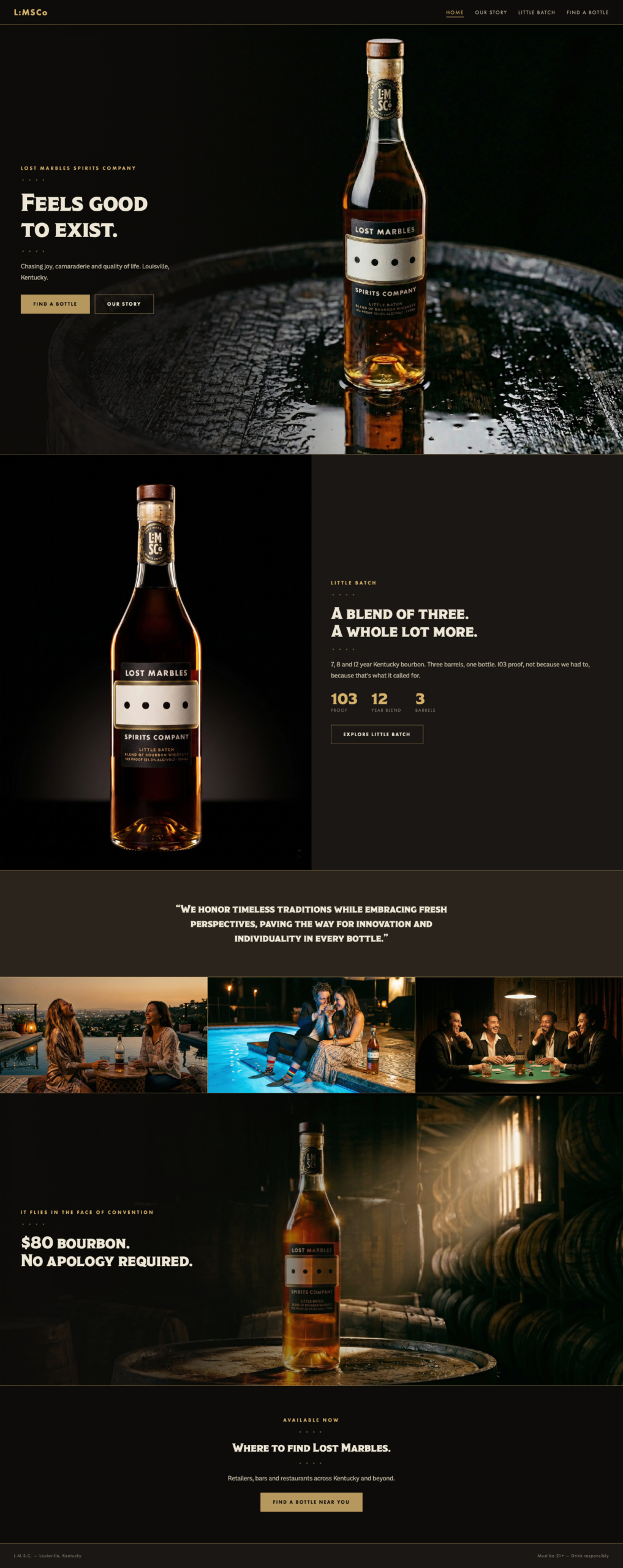
The finished home page, built page by page in direct collaboration with Claude.
I built the full brand system from that one paragraph they supplied: typography, color, brand voice, photography direction and a working prototype of the site.
To save tens of thousands of dollars on custom photography, I generated most of the brand imagery with Gemini and ChatGPT.
For the site itself, I worked directly with Claude, page-by-page. I’d describe exactly what I wanted: the typography pairing, the mood of a specific photo crop, how a transition should feel, the tone of a line of copy. Claude built it.
I’d review what came back against the brand system, catch what was off and send it back with specific direction.
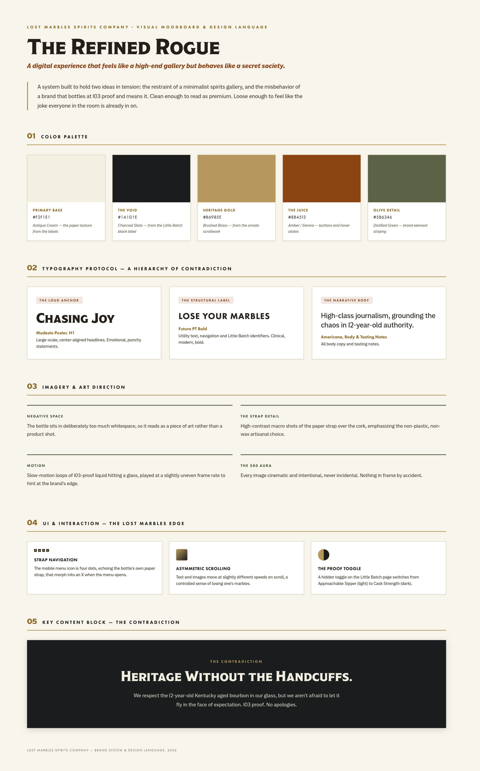
Color, typography, photography direction and interaction principles, locked down before a single page of the site was built.
The physical details carried as much weight as the digital ones. A solid walnut cap instead of wax. A hand-applied paper strap with four unexplained dots. A gold foil medallion set against a plain, utilitarian label on purpose.
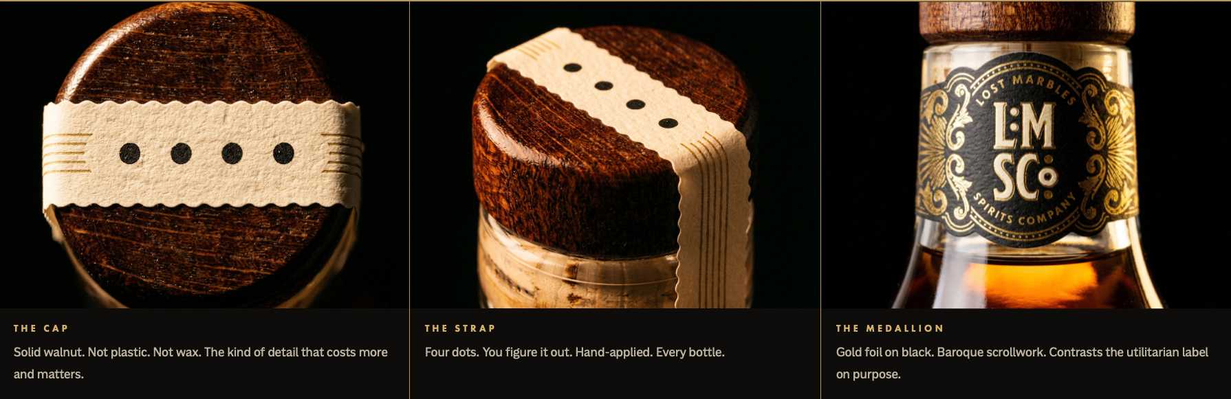
Photographed directly from the finished bottle: the walnut cap, the paper strap and the gold foil medallion.
Approach
Lost Marbles and I parted ways before the site went live. I kept building anyway, on my own time. The engagement had ended before I’d pushed the interaction design and the brand’s expression as far as I wanted.
Working without a client review cycle let me keep going: more reps directing Claude on something real and more room to take the brand further than a client sign-off would have allowed. What’s shown here is the complete body of work: the original brand system and client site, plus everything I built afterward.
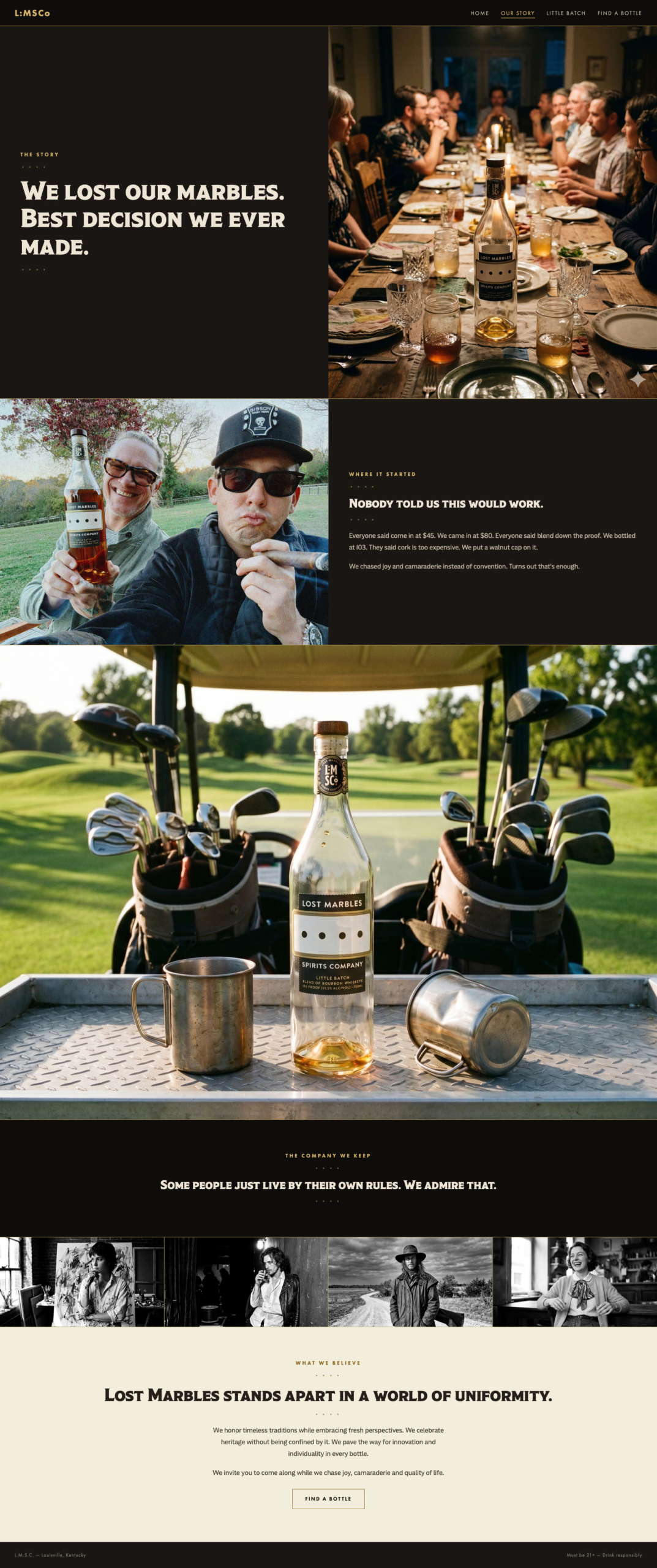
The finished Our Story page, built page-by-page in direct collaboration with Claude.