Design at scale; evolving an organization
The project to reimagine websterbank.com was a tectonic shift for the bank—not just for how we interacted with our customers, but for how we did business internally

The challenge
The Webster Bank customer or prospect was encountering many disparate experiences. Historically, decisions had been made in silos, multiple external agencies were in play, no governance existed—and in fact, no UX team existed—and the results were plainly obvious: Frankenstein design and low digital conversion across all funnels.
When this project was originally conceived, budgeted for and approved, the “public” site was in-scope, not other digital experiences attached to it. This was due, essentially, to org design. To begin to solve for the elephant in the room, I used the project budget to create an enterprise asset (a design system) that would eventually power all of the bank’s digital properties.
![]() I then set out to reinvent the way the bank handled projects like this. The project needed its own brand; something simple and memorable, both in name and meaning. The name Project Beacon came out of a quick leadership huddle in the middle of a day of community service in New Britain, CT. I then designed a logo for the project and an internal “roadshow” to build awareness and excitement.
I then set out to reinvent the way the bank handled projects like this. The project needed its own brand; something simple and memorable, both in name and meaning. The name Project Beacon came out of a quick leadership huddle in the middle of a day of community service in New Britain, CT. I then designed a logo for the project and an internal “roadshow” to build awareness and excitement.
One can always count on Urban Dictionary to tell it like it is. These two definitions proved accurate. I set out to use the Project Beacon brand as a guidepost for where I was taking the organization. We were not without our detractors in the organization, however—people that had been at the bank long enough to have endured a few different websterbank.coms, each promising to change the world, but not delivering. And that’s fine, and even understandable. To me, it was an opportunity to show people how this project was fundamentally different, and to shake the nickname “Project Bacon.”
The new approach
A customer's last best experience becomes their barometer for everything going forward
The approach to this project represented a marked shift in thinking for the bank: there was the inevitable pressure to “see” something almost immediately. I held firm and pushed back—we’d be leading with research that would help us understand our customers and what problems we even needed to solve. At an executive level, I was communicating our new approach to this project and leading with the bold perspective that I didn’t have all of the answers. In fact, I was setting out to actively challenge any pre-conceived notions that any of us—including myself—had about what to do and how to do it.
I led a 9 week discovery and research process where 1,300+ pages of research and data were reviewed, 50+ stakeholders from across the bank were interviewed and engaged in Design Thinking exercises, and hundreds of industry articles and studies were consumed. This resulted in a 150-page artifact that shaped our entire strategy for the project.
We took a good look at the competition, but really focused our efforts on the kinds of digital experiences that customers expect from their favorite brands. Our mantra: a customers’ last best experience becomes their barometer for everything going forward. In my time at Webster, I’d heard a lot of talk about “like-for-like,” “feature parity” and seen a lot of “feature factory” roadmaps. My strong point-of-view was that Webster wasn’t up against other banks as much as they were up against Amazon, Netflix, Spotify, and Uber—experiences people love today.
Project Beacon strategy document – the outcome of 9 weeks of discovery.
Design is a team sport
We began the design process by assembling everyone we could possibly think of that might have some interest, investment or accountability to what we were going to do. This included three-dozen partners from Brand, Marketing/Strategy, our Customer Care Center, Compliance, Legal, IT and vendor partners.
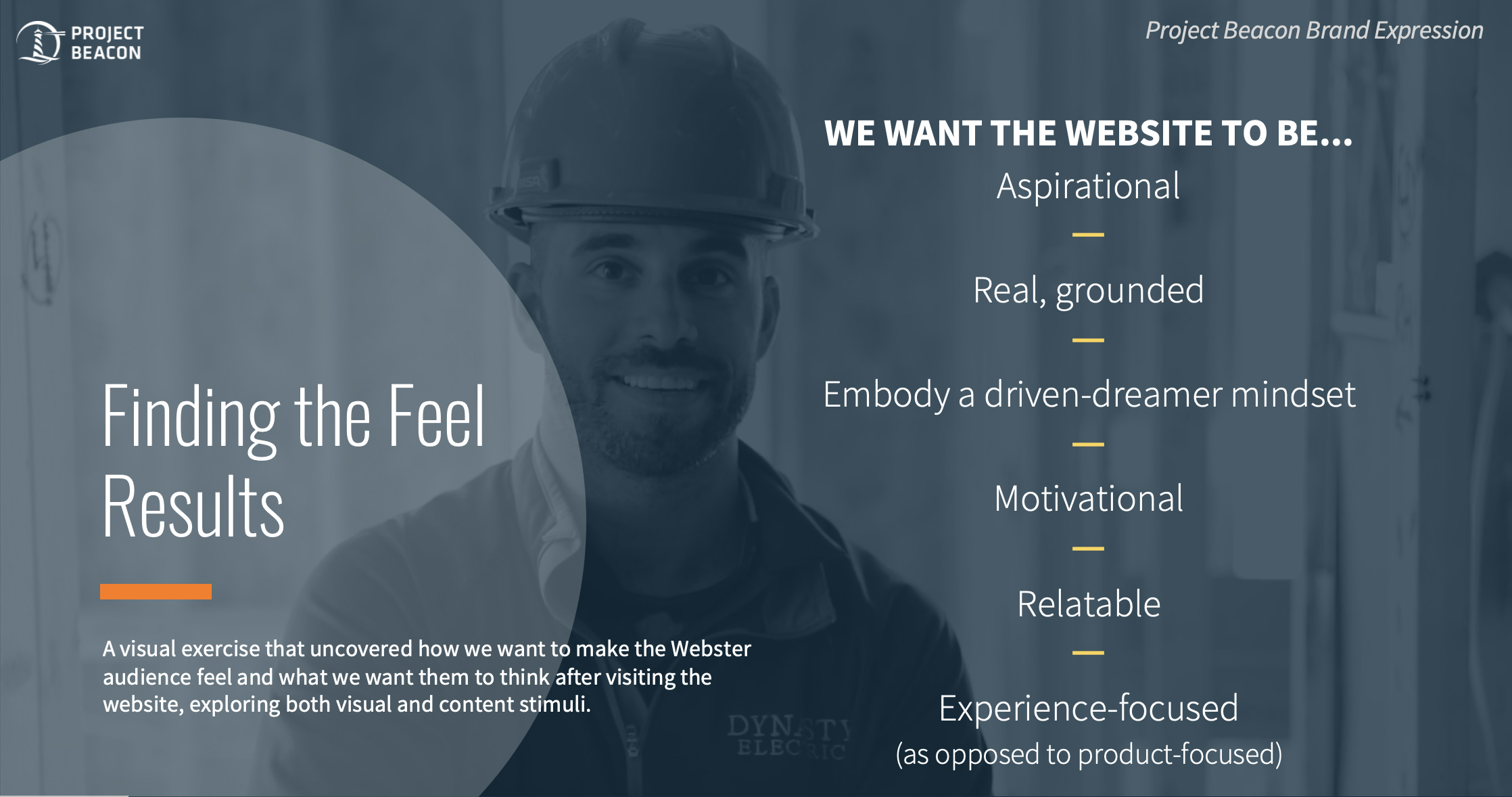
I co-facilitated a full day Design Thinking exercise we called “Finding the feel,” a visual exercise that uncovered how we wanted to make the Webster audience feel and what we wanted them to think after visiting the website, exploring both visual and content stimuli.
After arriving at a shared understanding of what we were after, I led my team through an intensive 6-week design process to define, design, test and iterate on the design patterns that would ultimately comprise our design system.
I pushed back on the desire from other stakeholders to see what they were used to—fully designed pages—and instead, we started with an inventory of content types on the old website and approached the design process as a means to solve for content types as components.
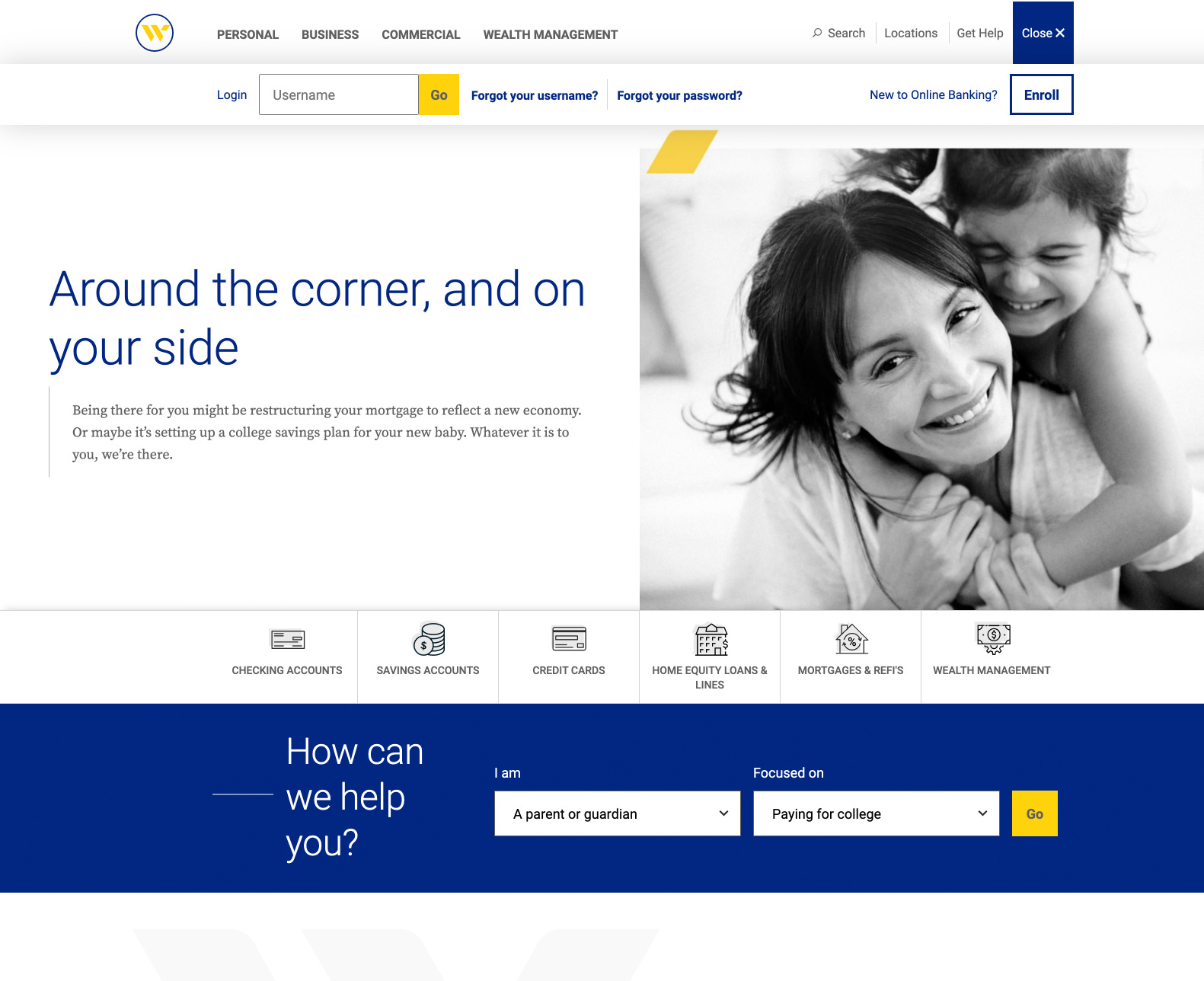
Webster Bank website redesign
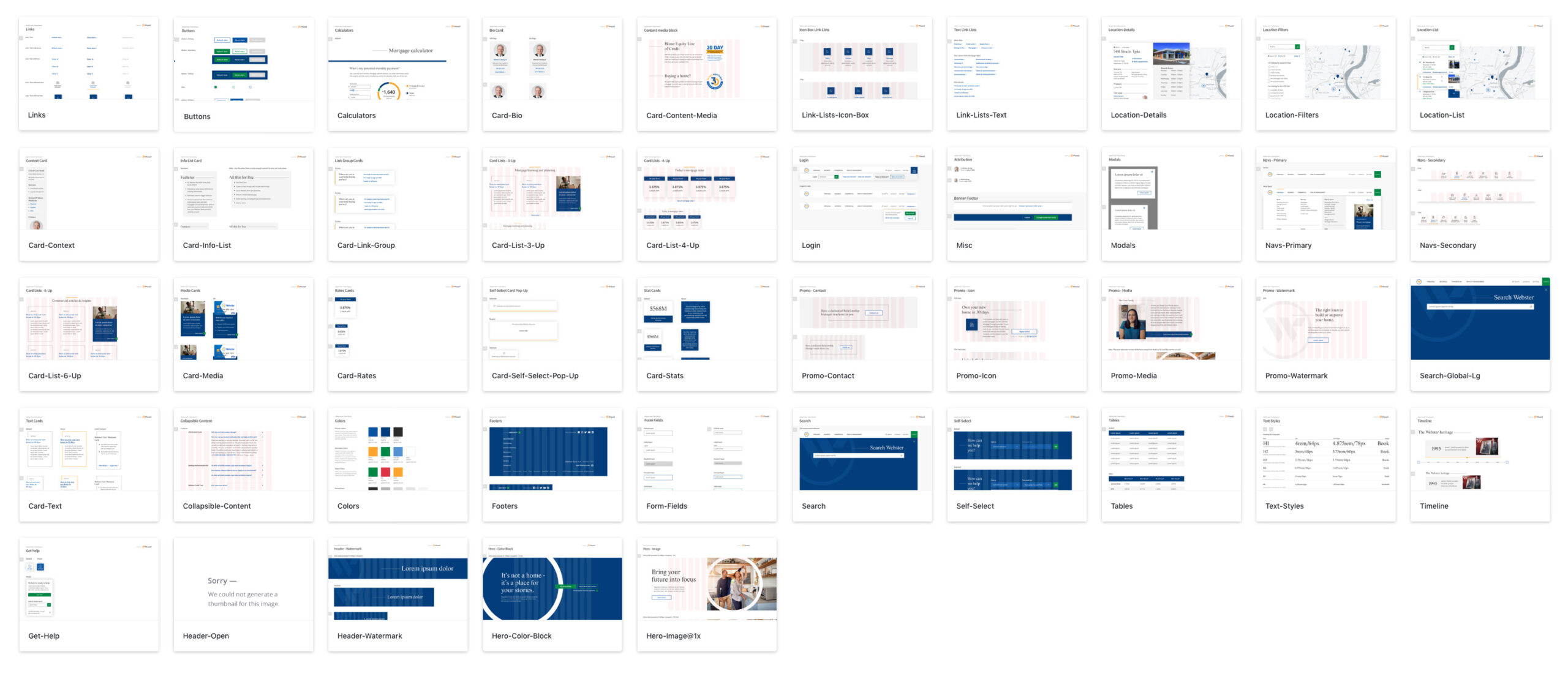
Webster Bank Project Beacon Design System components
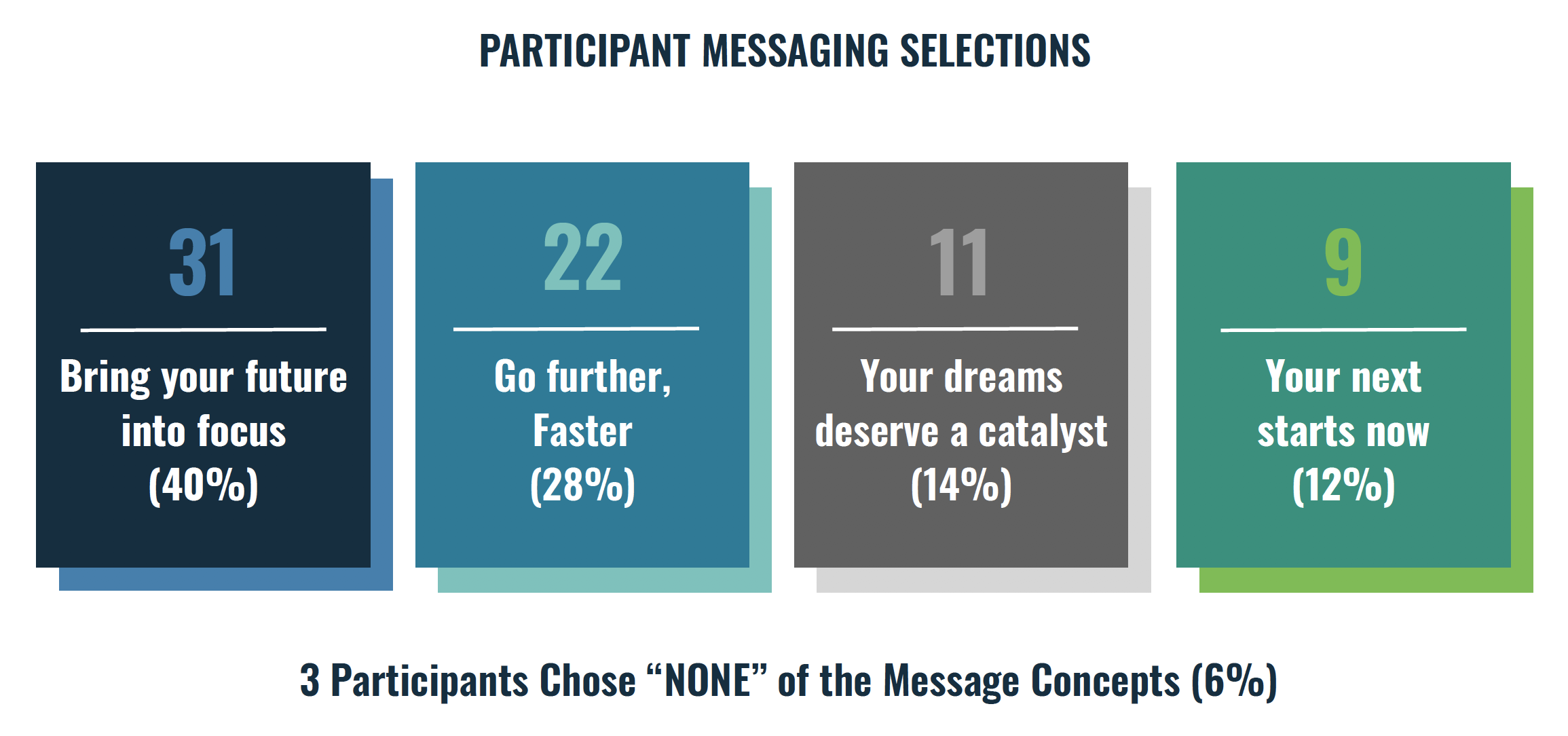
At the same time, we were exploring voice & tone, both via a refresh of the Webster Bank brand and its manifestation in channels such as the website. We began developing different messaging frameworks that could ultimately be repeatable and scalable across the website. Importantly, we also tested everything with users.
“If we have data, let’s look at data. If all we have are opinions, let’s go with mine.”
To bring visibility to this new approach, I socialized the methodology and results to executive leadership by highlighting my own biases that had been proven wrong via testing.
For instance, we had a messaging framework that we thought was hands-down the winner. It tested the worst of the four frameworks we tested—and by a lot.
I also began the project with my own strong opinion about the login box and that—by being front-and-center on the website—it was an impediment to effective design. Testing showed us conclusively that subjective opinions are dangerous—customers actually preferred to see the login box. This represented roughly 92% of the traffic coming to the website—a costly mistake if we had chosen to not listen to our customers and design something that we wanted and not what they were asking for.

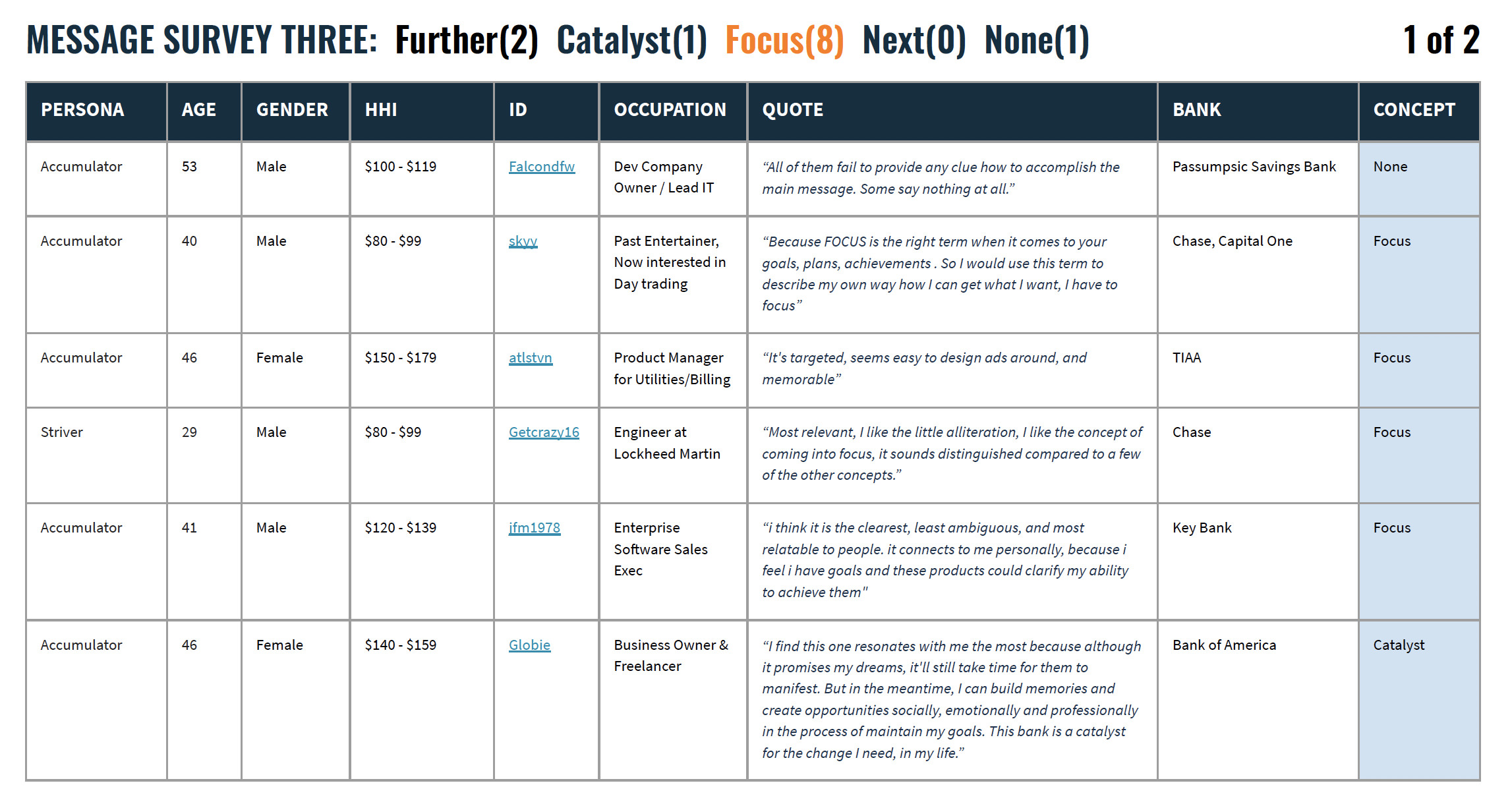
“You can create good experiences without knowing the content. What you can’t do is create good experiences without knowing your content structure. What your content is made from, not what your content is.”
The old website was 2,000+ pages. And it was a mess. No consistent taxonomy, no consistent IA, no consistent… anything. Our research and discovery uncovered that just 15 pages had been updated with the previous website redesign, 6 years prior. In that 6 years, marketing-related pages saw some sporadic updates, but there was never a cohesive plan; no 10,000 foot view of what we were even doing, why, or even a solid understanding for the medium for which they were writing. That meant that we had over a thousand pages of content that hadn’t been updated in a decade or longer.
For Project Beacon, my team was tasked with rewriting every single piece of content on the site, to align to our new customer-first approach. Writing for financial services—particularly Commercial banking—is not easy, nor was the volume of work to be done and the timeframe within which it needed to be accomplished.
I sourced and hired two contract copywriters from within my own network with this specialized expertise, repurposed an existing team member to oversee the effort and we began planning out how to tackle such a daunting task. We started with an in-depth information architecture assessment. The website navigation reflected more of a Webster Bank org chart than an intuitive tool for a customer or prospect, so we worked to streamline and make it more intuitive. We then tested the approach with users to confirm understanding.
We identified key SMEs for every single page of the website and established shared accountability for the creation of the content. Once we did that, we setup discovery sessions with each SME to dig deep into their business and to make sure we were articulating it as accurately as possible. We also took this opportunity to bring SMEs up-to-speed on our approach to content, and the need to be truly customer-focused. In doing this, we established clear swimlanes as well. For example, we’d be asking SMEs if the content we had crafted was factually accurate, but also made clear that we were not looking for their feedback on brand voice & tone. This inclusive approach to the project created excitement, helped dispel the notion that this project was no different than its predecessors and created the shared accountability we were after—prior versions of the website had felt (this is a direct quote) like “something marketing was doing off in their ivory tower.”
When it came time to start writing, we needed a very carefully crafted and communicated plan to account for the multiple layers of involvement within the organization and our extremely tight timeline. We then started writing the highest-profile pages; the pages closest to key customers journeys or marketing funnels and branched out from there.
We also had two parallel paths for content creation in service to our “customer at the center” philosophy:
Key customer moments: we began writing new content focused on key customer life moments. The pages were intended to be a purely informational resource—no sales pitch; no marketing. Just helpful information, from a trusted advisor.
Webster Bank in the community: the organization and its employees are very active in the communities where we live and work, but it’s information that was historically buried. One of the tenets of the brand guidelines was always “we don’t talk about ourselves.”
In a world of rapidly-evolving customer expectations, this needed to change. It’s difficult for a bank to differentiate itself in the market. We realized that the things that make Webster Webster were the things that actually could differentiate. We also knew from our research that our younger generations want to do business with companies that stand for something. This kind of info means a lot to them—they seek it out.
Responsibilities
Project Beacon required me to lean on the positive working relationships I had built over the years at the bank and also to perfect diplomacy. On a high-profile project like this, every stakeholder always thinks that the content they “own” is the most important and that their priorities supersede everything else. The reality, however, was that we had to focus efforts on where they’d make the most impact and prioritize accordingly.
Leadership
- Short- and long-term vision for the project
- Creative vision & direction
- Leadership & direct management of Experience Design team of 7 direct reports
- Alignment of internal stakeholders to facilitate new methods of engagement and customer-facing testing
- Communication and engagement with executive leadership
Project management
-
Daily touchpoints with various teams to ideate, strategize, and ensure velocity & execution
-
Development and management of $1.25MM budget, project plan, including sprint planning, resource allocation & daily/weekly communication with internal stakeholders
-
Managed communications and workflow of five-dozen people across cross-functional internal teams, including
-
internal IT development
-
Vendor partner
-
Experience Design team
-
Brand
-
Digital Marketing
-
Market Research
-
HR
-
Lines of business
-
Business Analyst
-
Project Manager
-
IT
-
Enterprise QA testing team
-
Compliance
-
Legal
-
Procurement
-
Success metrics
-
Application starts up 600%
-
Application submits up 320%
-
Accounts acquired digitally up 40%
-
Number of sessions up 4% WoW
-
Organic search impressions up 52%
-
Call center volume never exceeded forecast in the months following launch (a huge victory)
-
Call center volume for possible self-service tasks down 8%, due to better site organization
-
Page load speed 10x faster
-
WCAG 2.0 ADA compliance
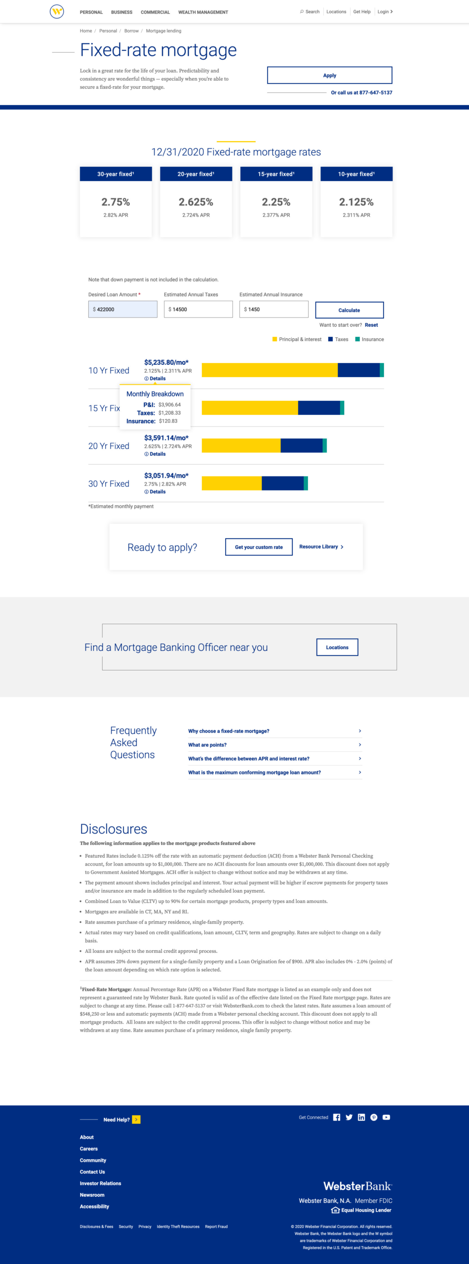
Websterbank.com fixed rate mortgage page redesign
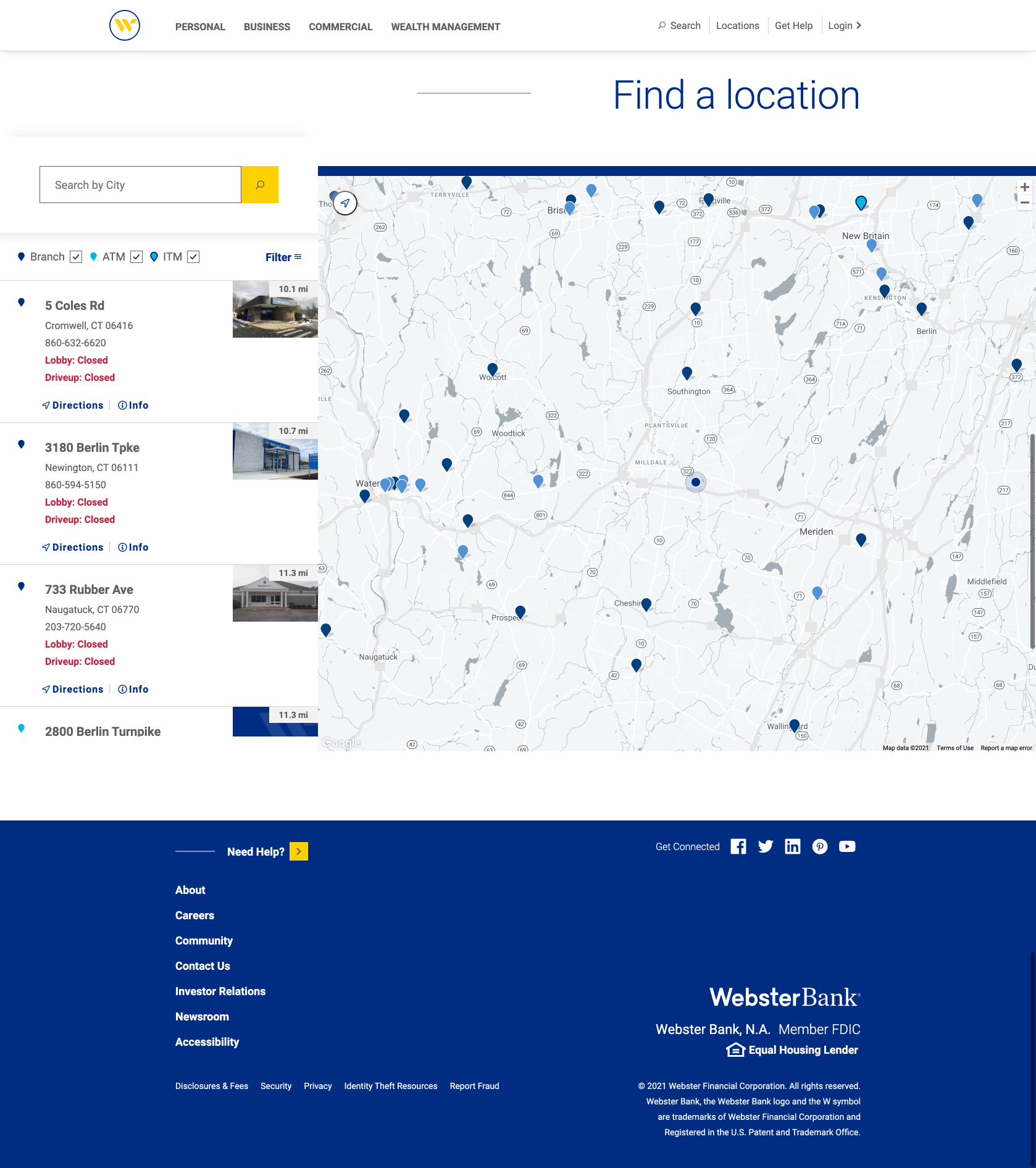
Websterbank.com location finder redesign